01LA LORRAINE BAKERY GROUP
Managing two distinct B2B brands across campaigns, packaging, retail and physical brand experiences.
Creative direction and design across La Lorraine and Donut Worry Be Happy for Turkey, the Caucasus and Central Asia.
02Overview
An embedded creative role inside a regional B2B marketing operation.
From February to November 2023, I worked on La Lorraine Bakery Group as Marketing Art Director while employed by Bal Agency. Rather than operating through a conventional agency workflow, I was embedded within LLBG’s Turkey, Caucasus and Central Asia marketing team, working from the company’s headquarters three days a week and reporting directly to the regional Marketing Director.
After leaving Bal Agency in November 2023, my relationship with LLBG continued independently on a project basis until July 2024.
Across that period, I worked on both La Lorraine and Donut Worry Be Happy, two B2B brands with distinctly different visual languages, across campaigns, packaging, events, retail environments, print production, digital channels and sales materials.
03The Creative Challenge
Consistency without making two brands look the same.
La Lorraine and Donut Worry Be Happy operated under the same group, but they were not interchangeable brands.
La Lorraine required a warmer, product-led visual language built around bakery categories, commercial clarity and B2B communication. DWBH was deliberately more playful, colourful and expressive.
The challenge was therefore not to create a single visual system for both brands. It was to maintain the integrity of two different identities while adapting them to a wide range of commercial realities — from packaging and campaigns to retailer requirements, physical environments, events and digital platforms.
The system had to stay recognisable while the context kept changing.
04Two Brands. Two Different Languages.
The distinction had to remain visible in every design decision.
Consistency meant protecting each brand’s own logic, not applying one style to both.
La Lorraine
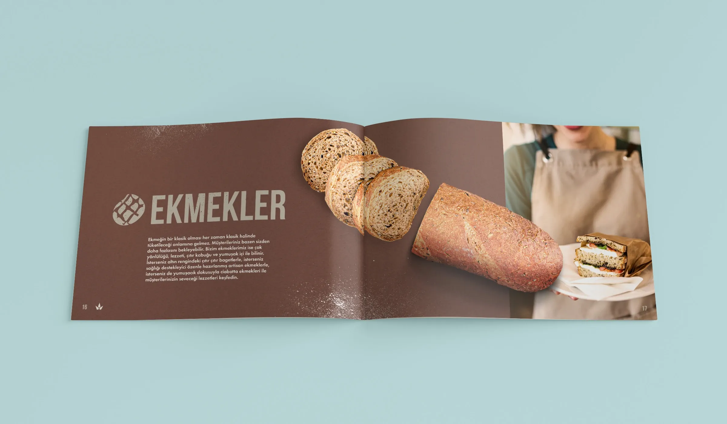
For La Lorraine, the work foregrounded appetising product imagery, warm tones, clear category cues and the commercial clarity expected in B2B sales communication. A broad bakery portfolio had to remain easy to navigate across catalogues, campaigns and retail applications.
Donut Worry Be Happy
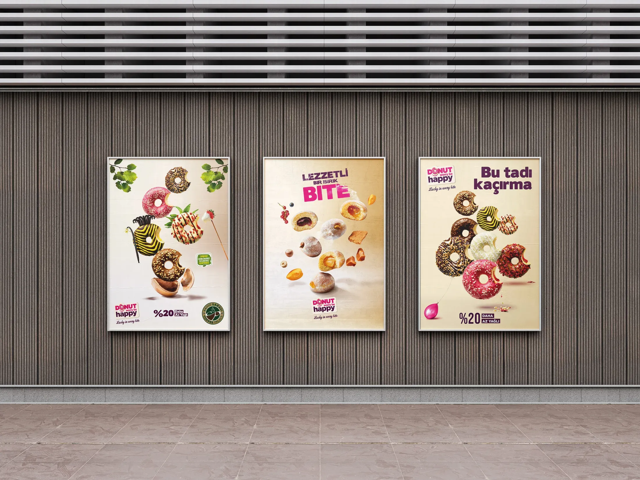
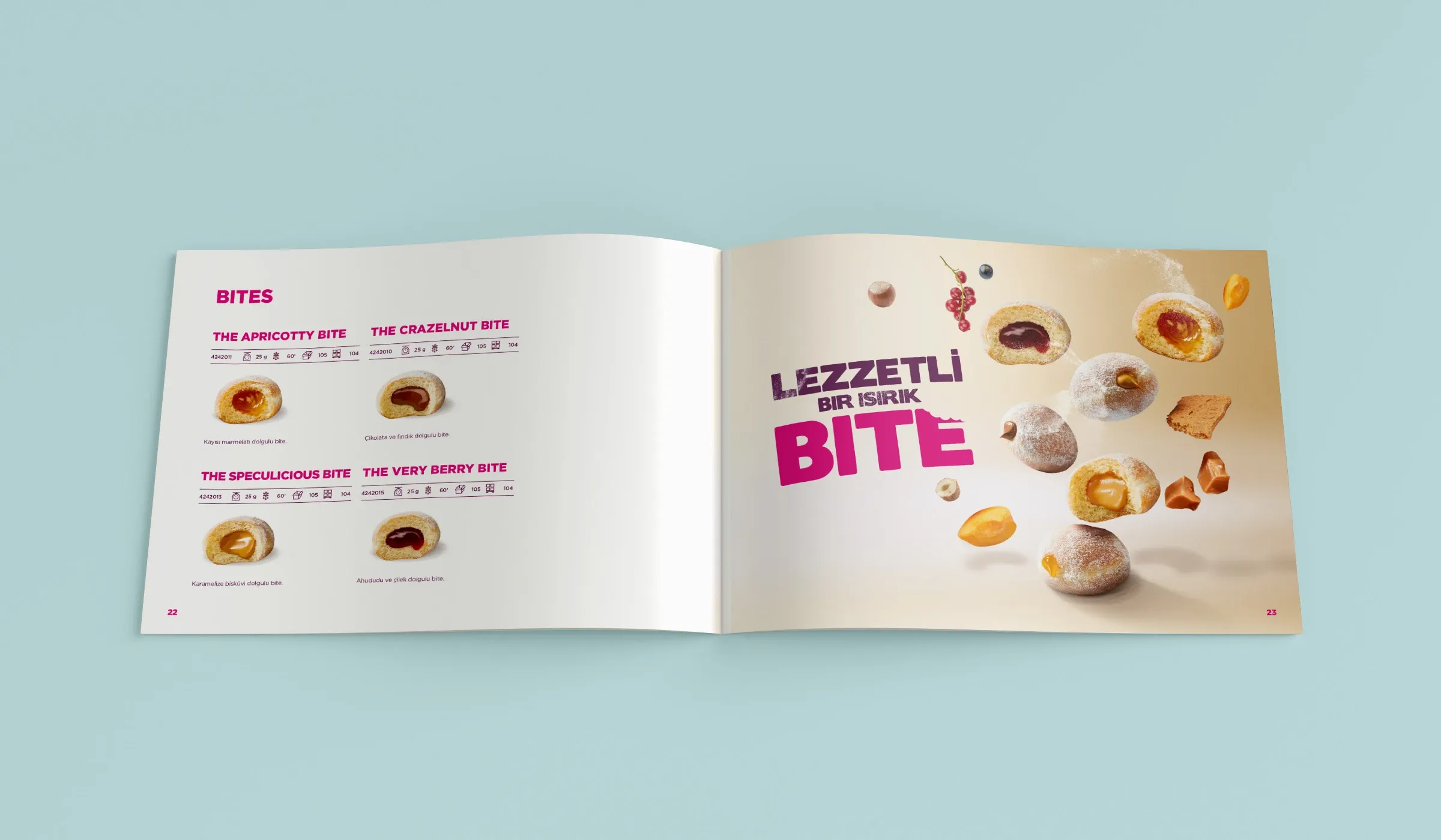
For DWBH, the system shifted towards saturated colour, expressive typography and a more playful rhythm built around donuts and filled bites. Packaging, campaigns and point-of-sale pieces could speak more loudly, but still needed discipline as they moved between formats.
05Embedded Creative Leadership
Ownership began before the first layout and continued beyond approval.
Working inside the regional marketing operation allowed me to engage with a brief at its source: clarifying the business and channel context with the Marketing Director and team, defining the creative direction, then shaping the design system around how the work would actually be used.
My responsibility continued through concept development, design presentation, stakeholder feedback and revision, production-ready artwork, supplier coordination, and pre- and post-production checks across print and digital applications.
This continuity linked decisions that might otherwise have been fragmented across campaigns, packaging, retail, events and sales materials.
The role was not simply to deliver graphics. It was to hold the creative line from brief to production.
Brief & ContextCreative DirectionPresentation & ApprovalProduction-Ready ExecutionPhysical / Digital Control
06Yeni Yayın Dönemi
A regional meeting became a complete brand environment.
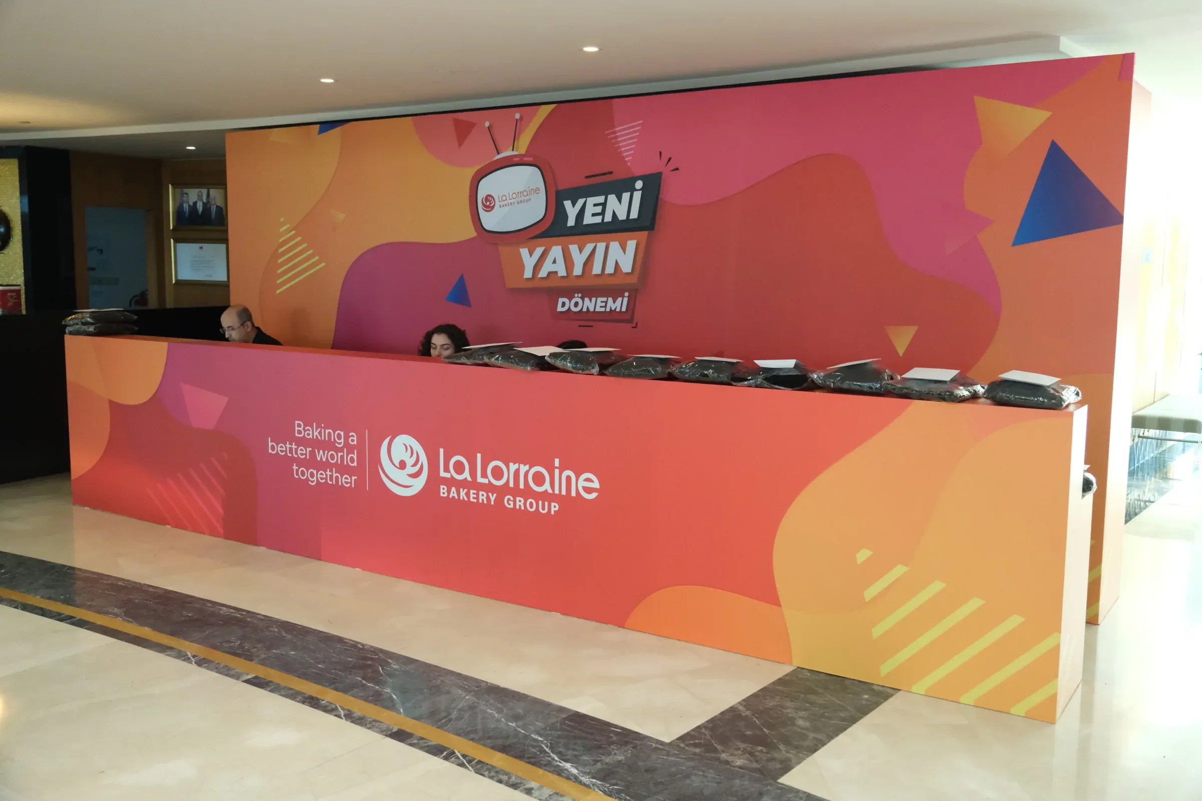
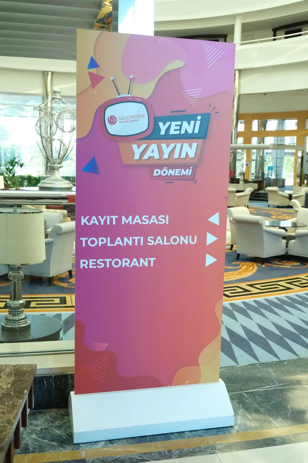
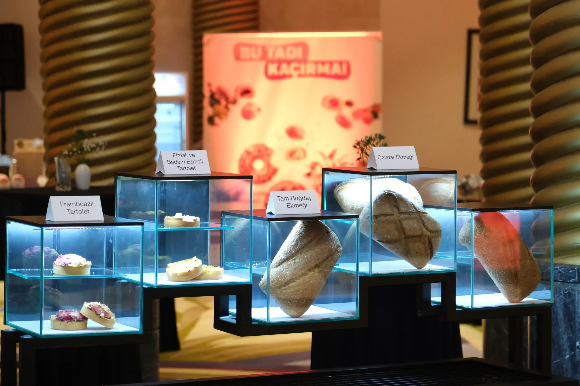
For LLBG’s 2023 Sales & Marketing and Distributor Meeting in Antalya, I developed the creative concept and visual identity for Yeni Yayın Dönemi, then carried the system across the physical experience.
Held in March 2023 for around 200 participants, including senior leaders from Turkey, the Caucasus and Central Asia, the event required one identity to work at very different scales: reception and registration, wayfinding, a photo wall, category posters, an attendee brochure, and product launch and display areas.
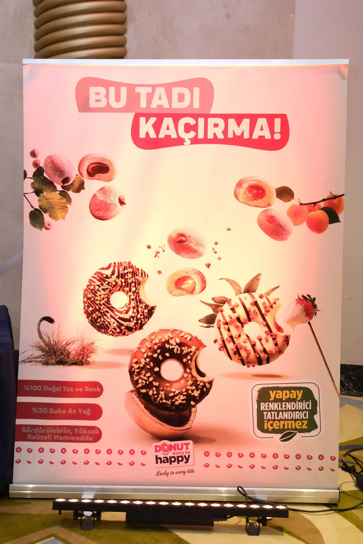
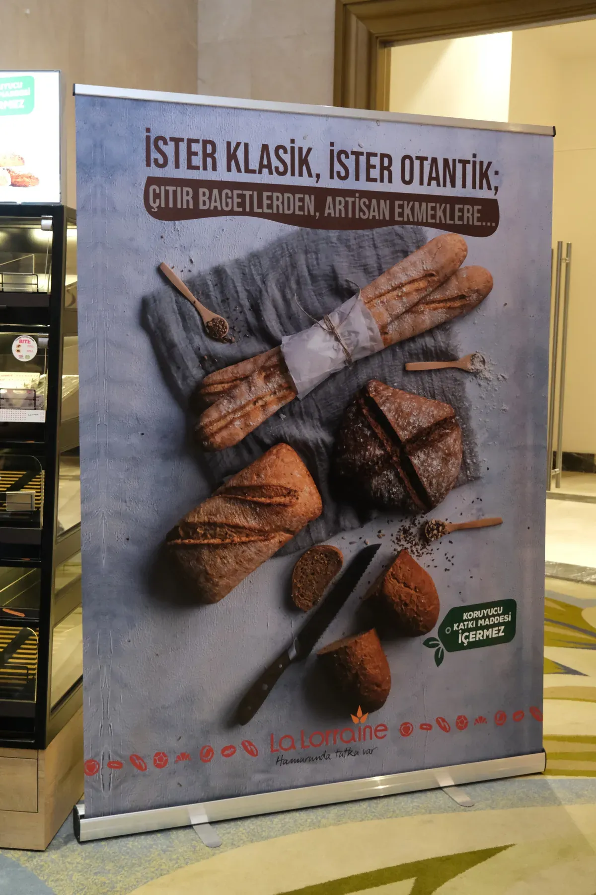
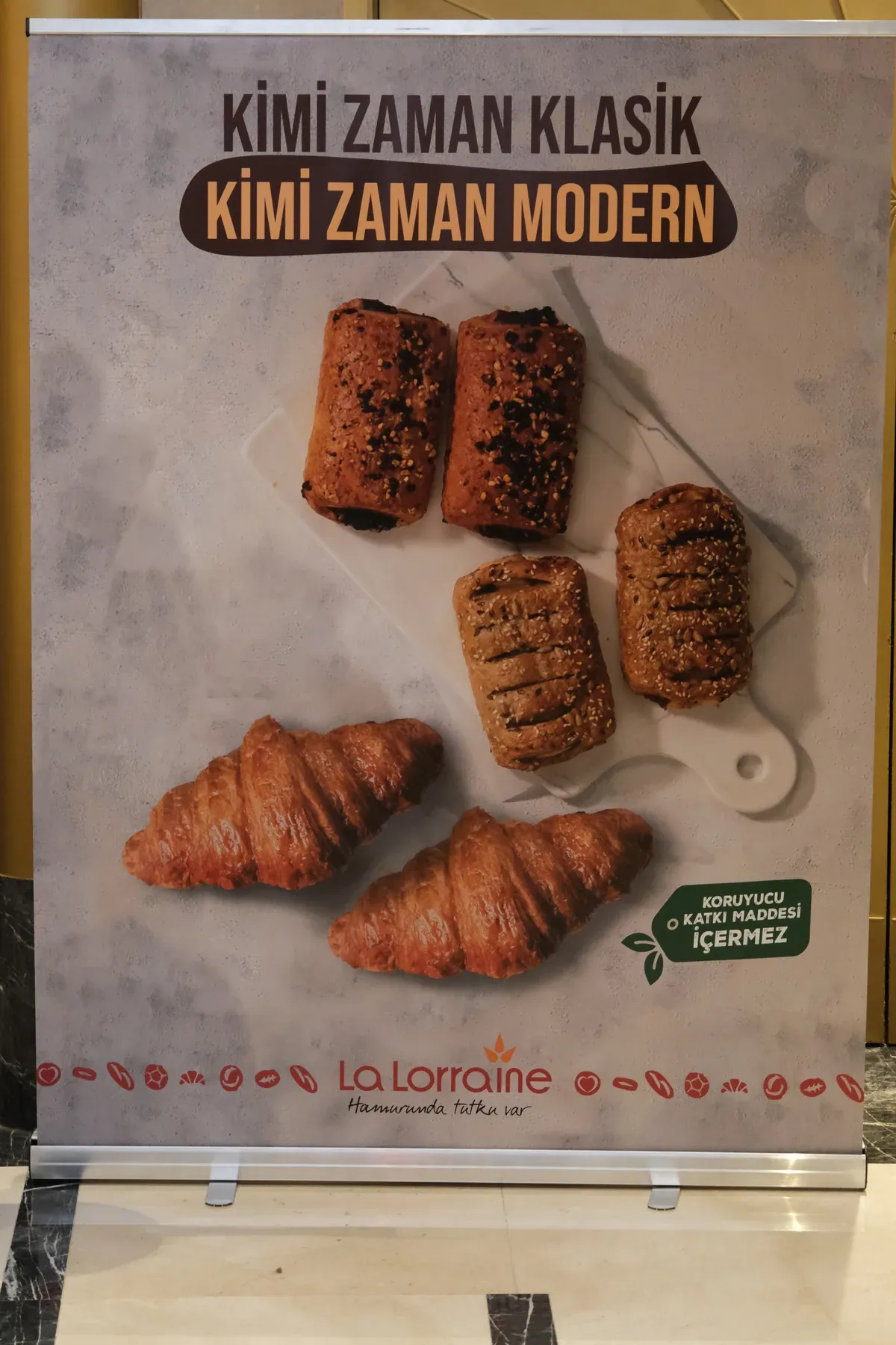
I designed all printed and environmental applications, presented the system to Regional Marketing Director Eray Şahinbay, and carried it through approval and production. For the product launch platform, my responsibility covered the visual arrangement and product presentation; the structural design was developed externally.
The idea did not stop at the key visual. It became the space.
07Onsuz Olmaz!
One platform. Multiple occasions.
Onsuz Olmaz! was developed collaboratively by me, Bal Agency and LLBG Marketing as a flexible campaign platform rather than a single fixed message.
I developed the contextual variations and translated them into visual executions around specific products, channels and consumption moments. Kahvaltılar Onsuz Olmaz!, Acıktığında Onsuz Olmaz!, Sofralar Onsuz Olmaz!, Beş Çayı Onsuz Olmaz! and Kahve Keyfi Onsuz Olmaz! allowed the same core idea to move from a family breakfast to a coffee-and-croissant cross-sell, then into posters, billboards and retail communication.
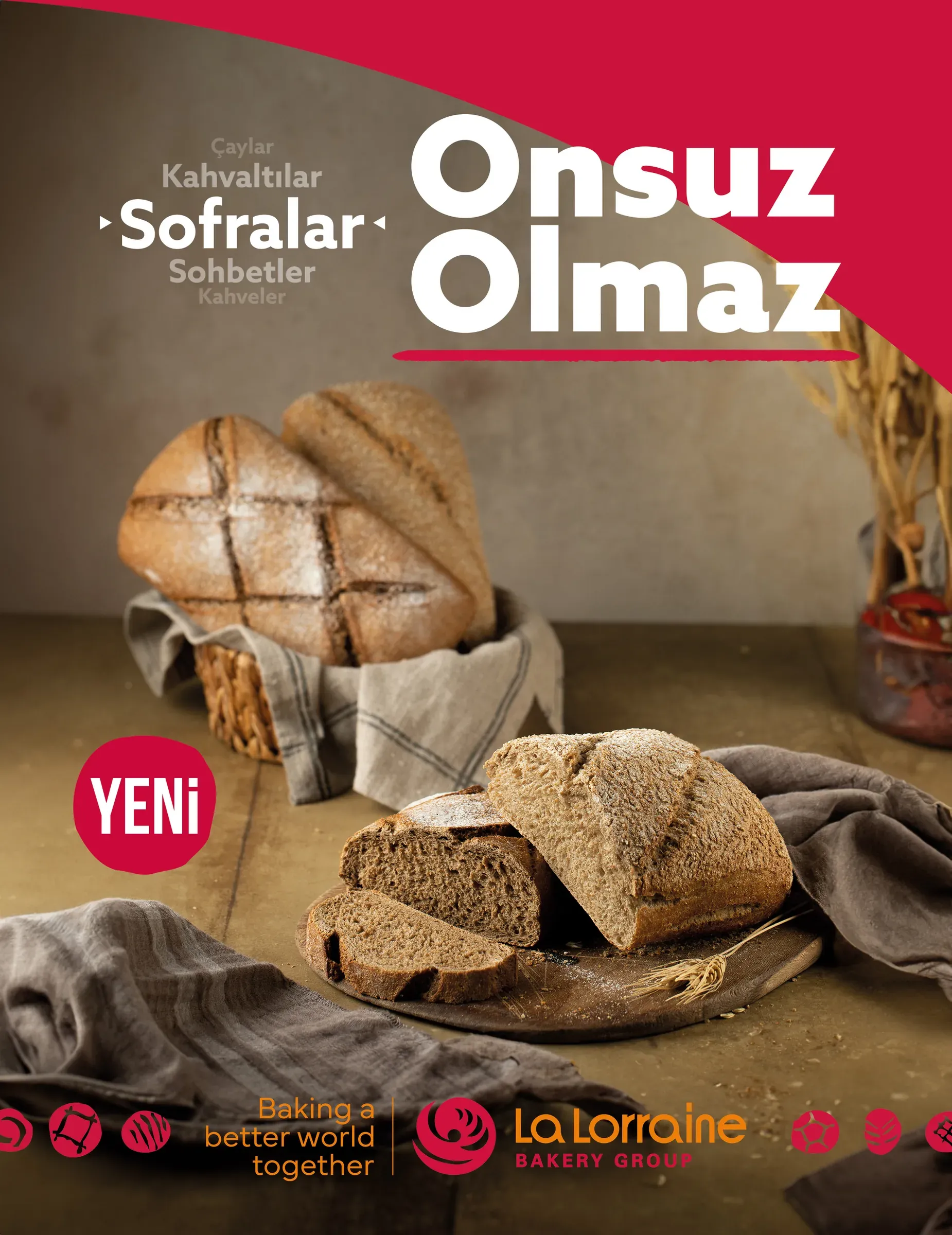
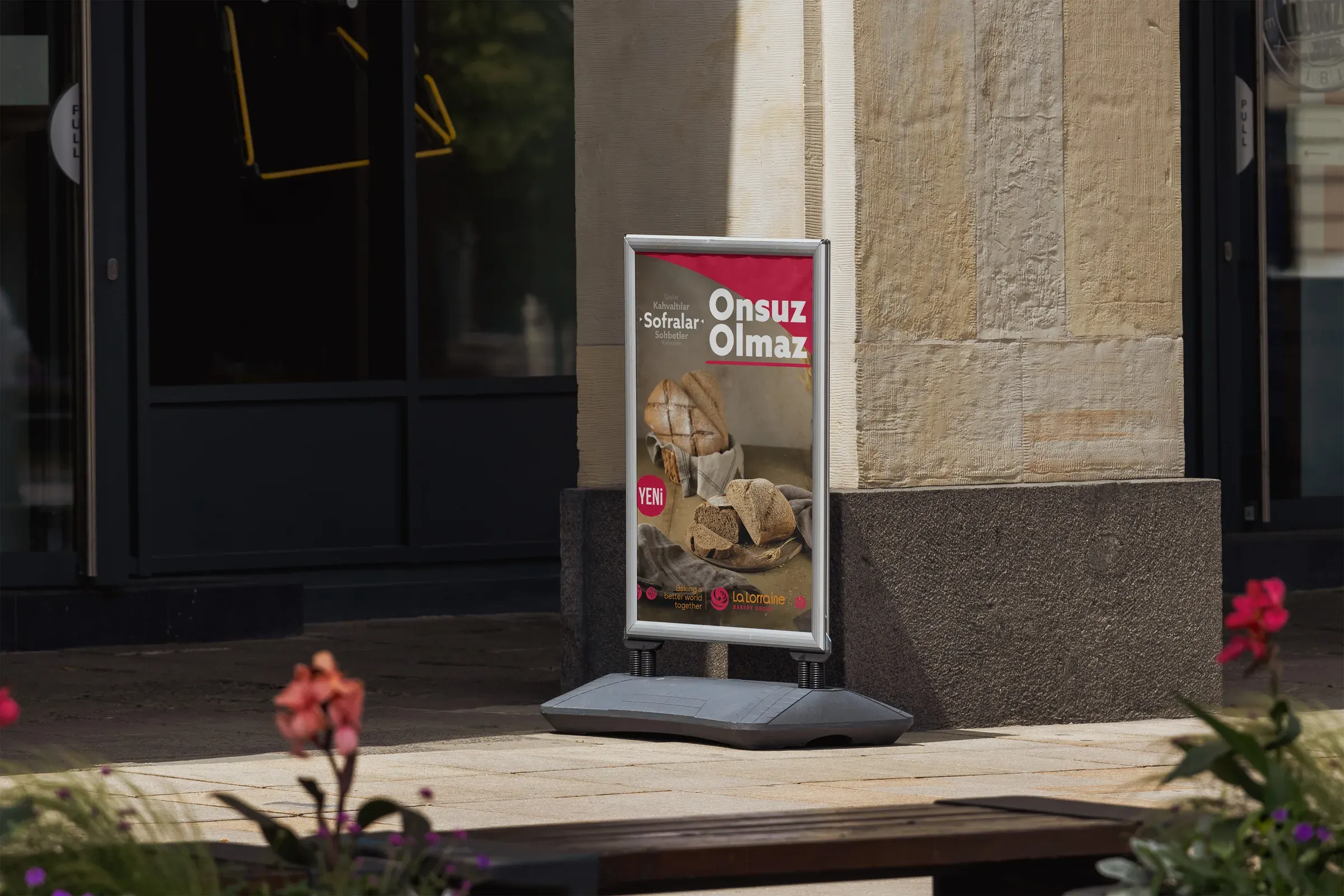
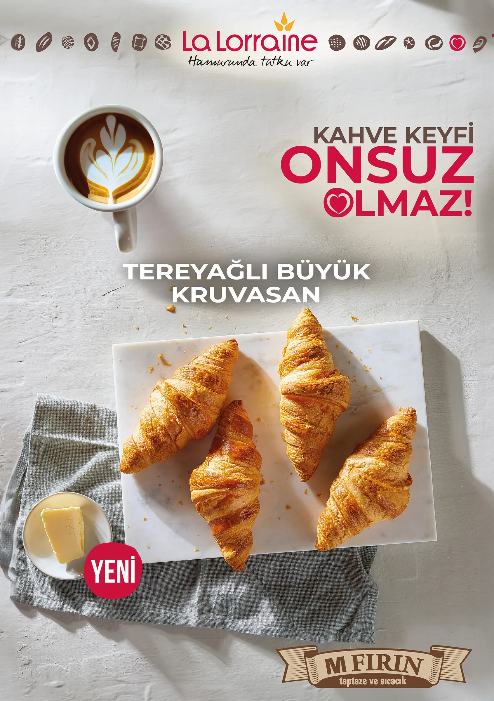
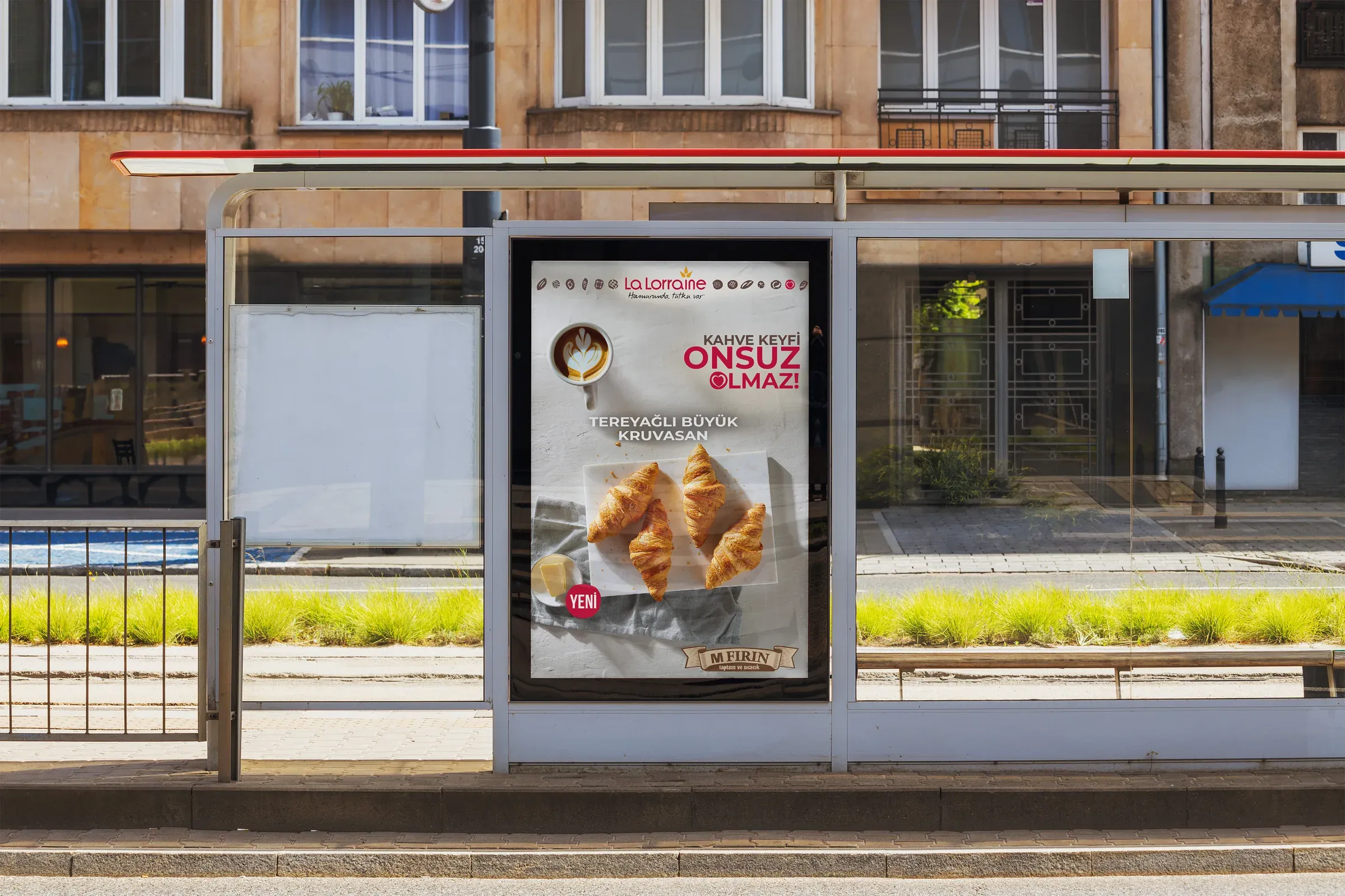
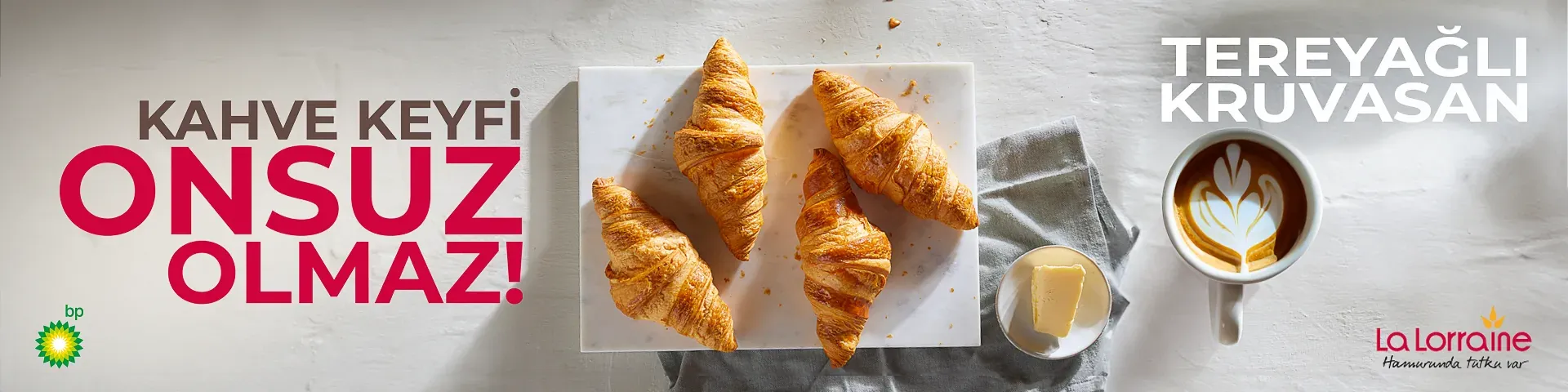
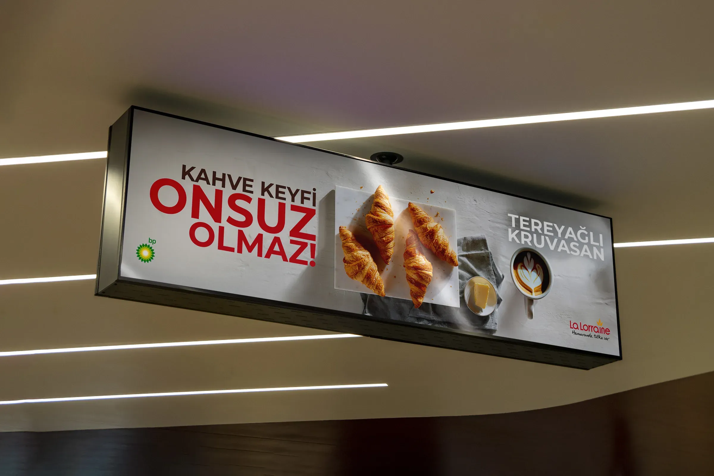
Each variation was presented to Regional Marketing Director Eray Şahinbay and refined through feedback before execution.
The consistency came from the platform. The relevance came from changing the message with the moment.
08DWBH Packaging
A playful brand language, built to work as a packaging family.
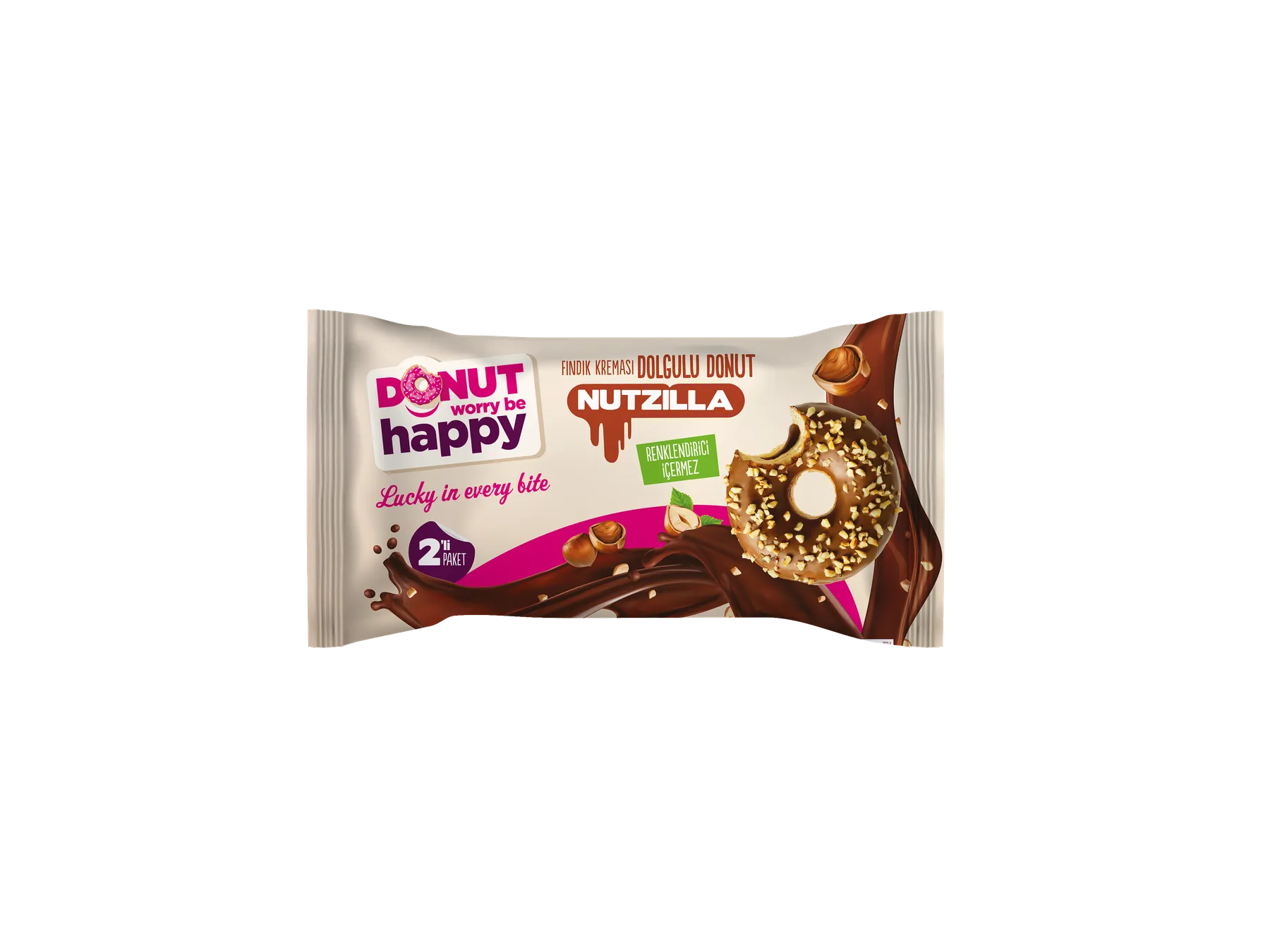
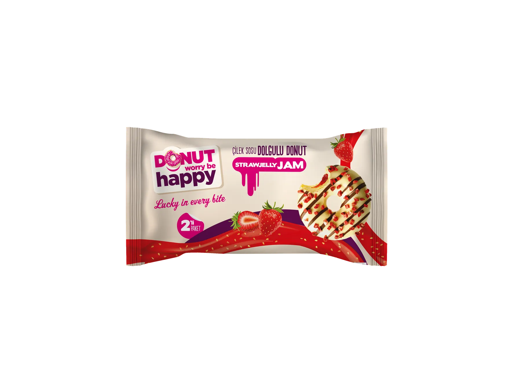
For DWBH, I designed the packaging for the Nutzilla 2-pack, Strawjelly 2-pack and Nutzilla 4-pack frozen product. From creative concept and pack layout to final artwork, I translated the brand’s expressive, colour-driven character into a system that gave each product a distinct identity while keeping the range recognisable as one family.
The front of pack needed to communicate personality and product appeal immediately. The wider system also had to accommodate pack count, preparation guidance and mandatory information without losing the energy of the brand.
Different products, one unmistakable DWBH attitude.
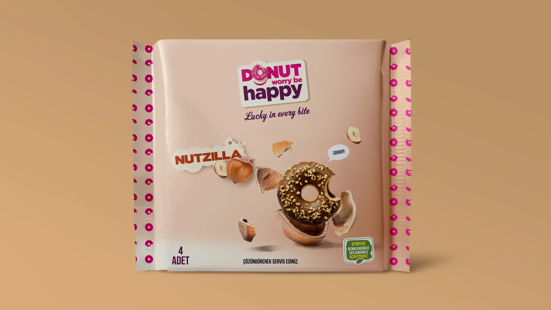
Creative concept, package layout and final artwork by Efe Can Akar.
09Packaging to Prepress
The design continued into production.
A packaging concept was only complete once it could be manufactured accurately. For the Nutzilla and Strawjelly 2-packs, I took the designs from visible packaging into production-ready prepress artwork.
This meant resolving the 245 × 280 mm working structure together with dielines, fold logic, roll direction, front-and-back architecture, and the dense set of product, allergen, nutrition, storage and importer information required on pack. I also managed communication with the print partner and followed the work through pre- and post-print checks.
The finished pack was the visible result. Production accuracy was the work behind it.
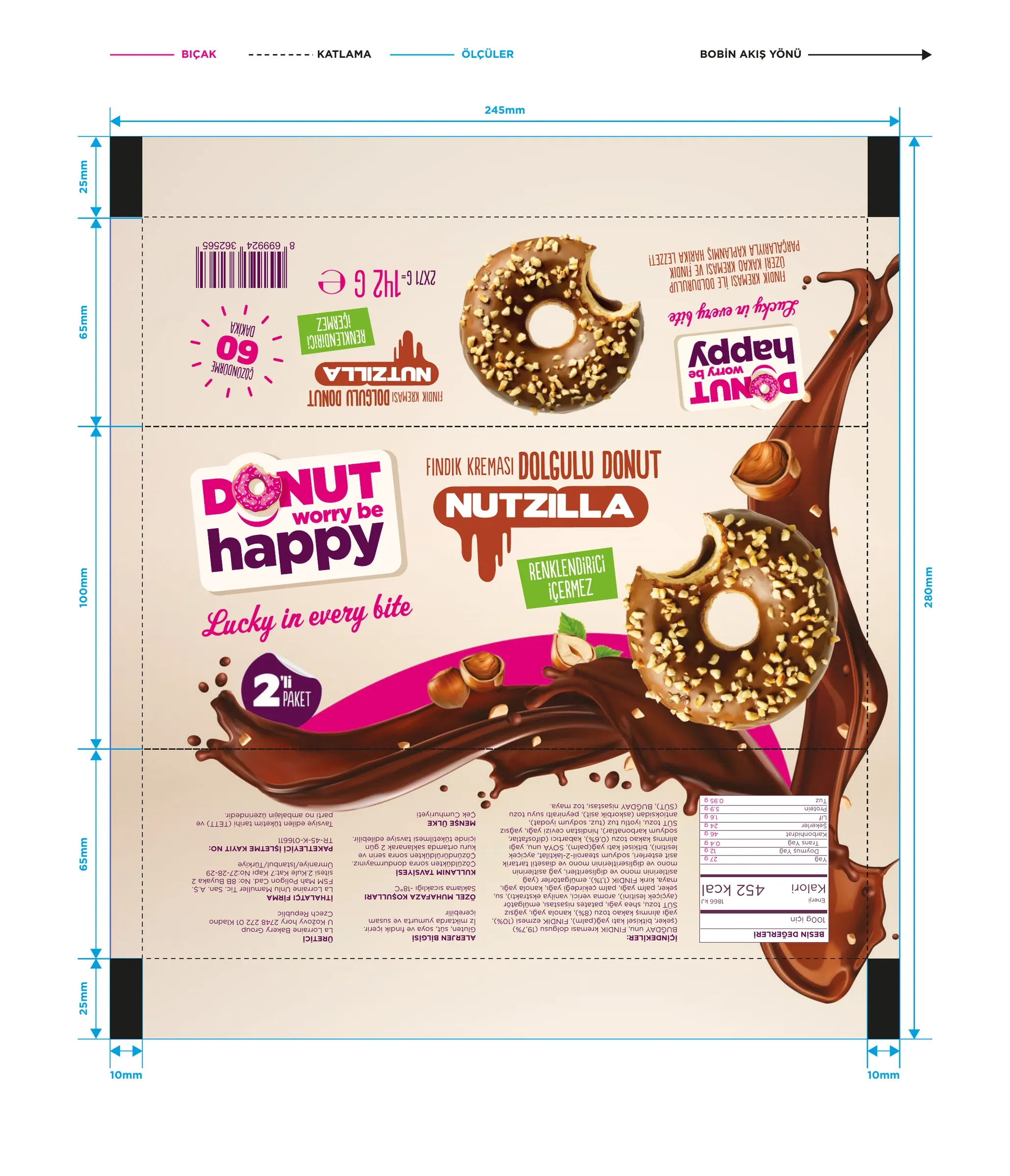
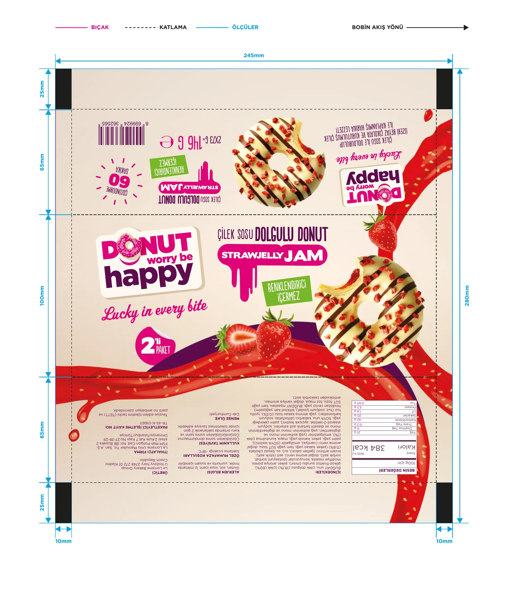
Concept, package layout, artwork and prepress by Efe Can Akar.
10Retail & Channel Adaptation
Two distinct brands, many commercial environments.
Retail work rarely arrived as one repeatable format. Each partner and channel brought its own dimensions, product priorities, viewing distance and commercial constraints.
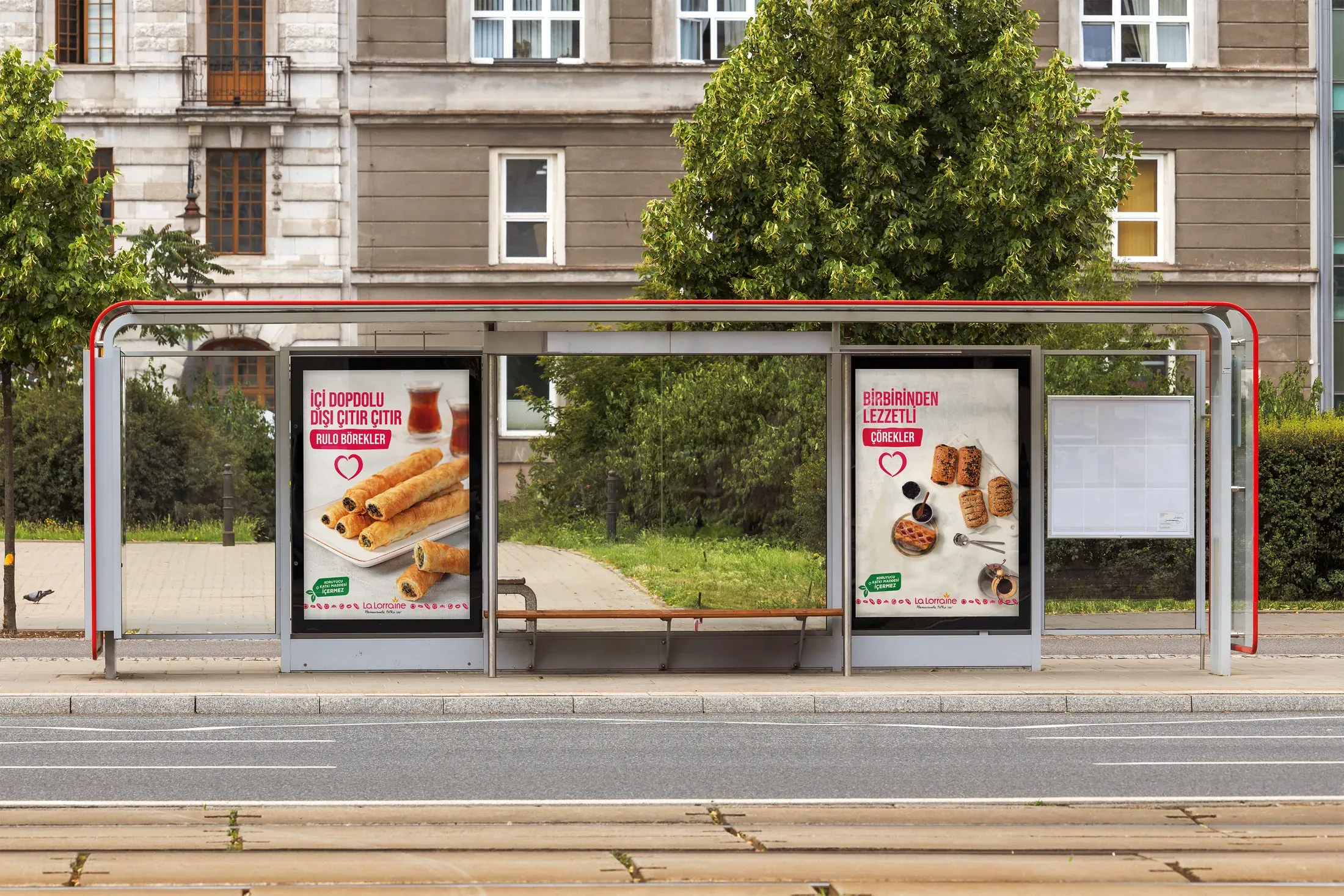
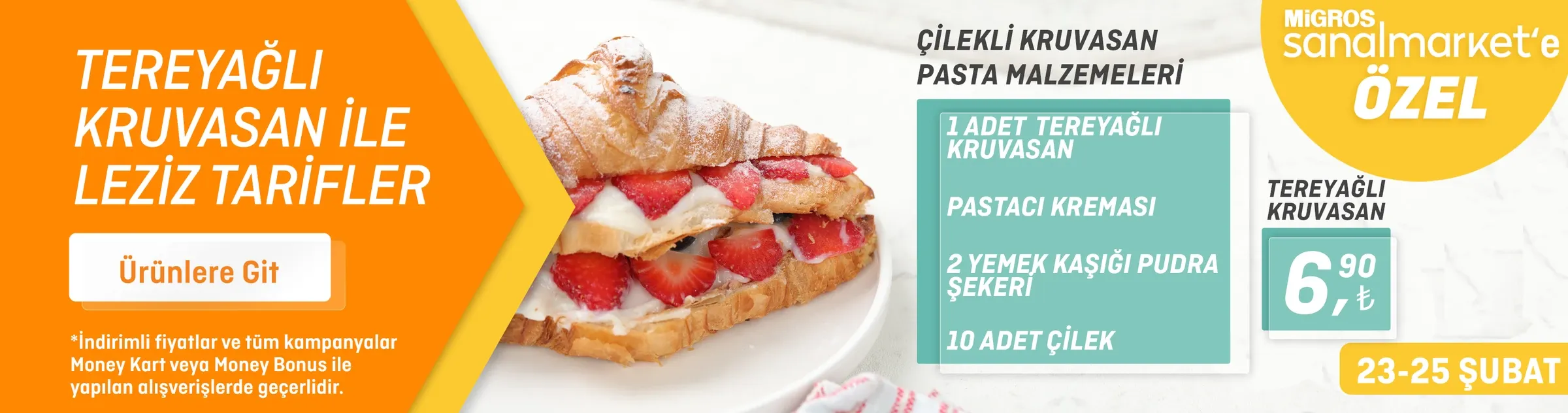
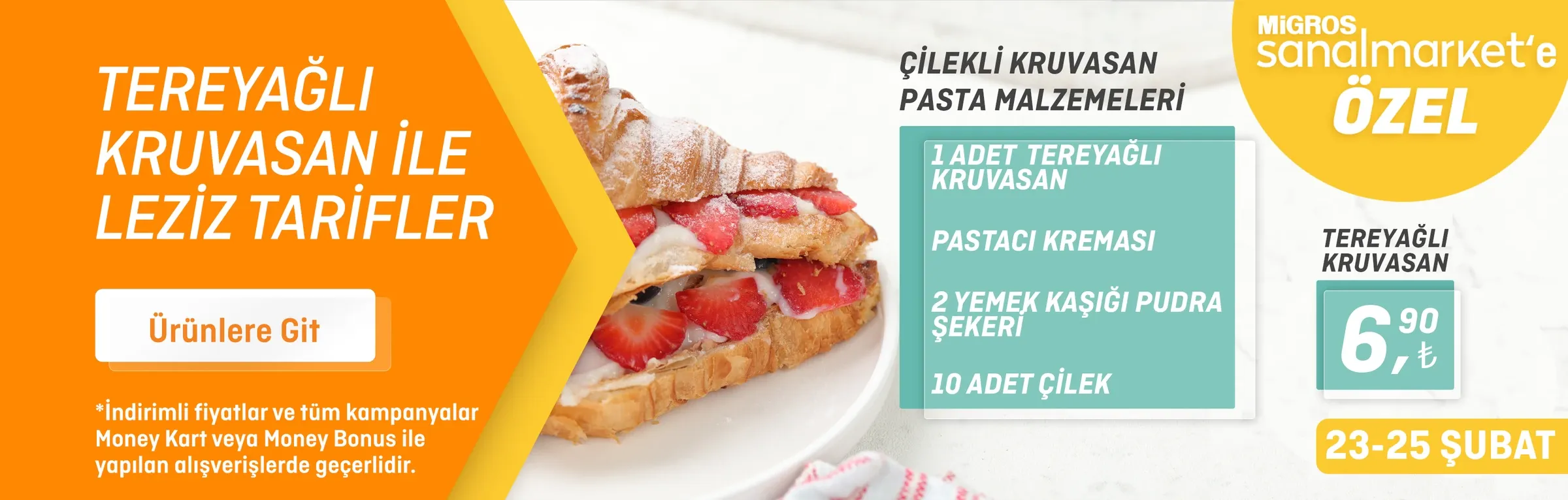
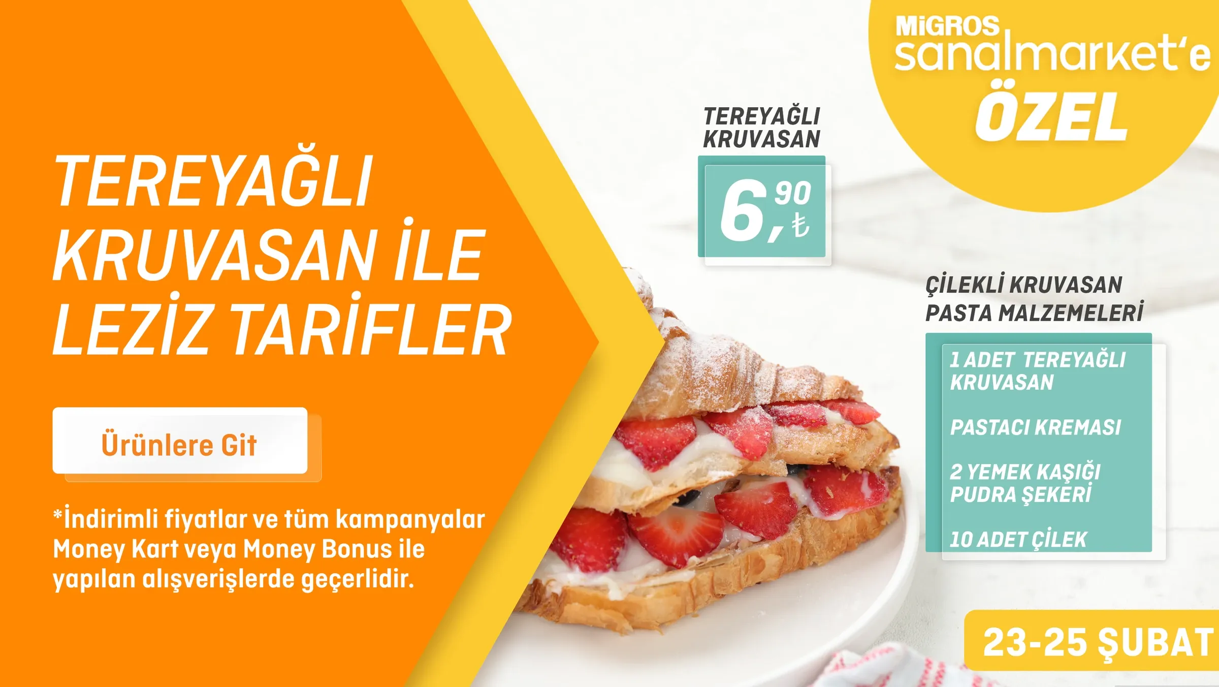
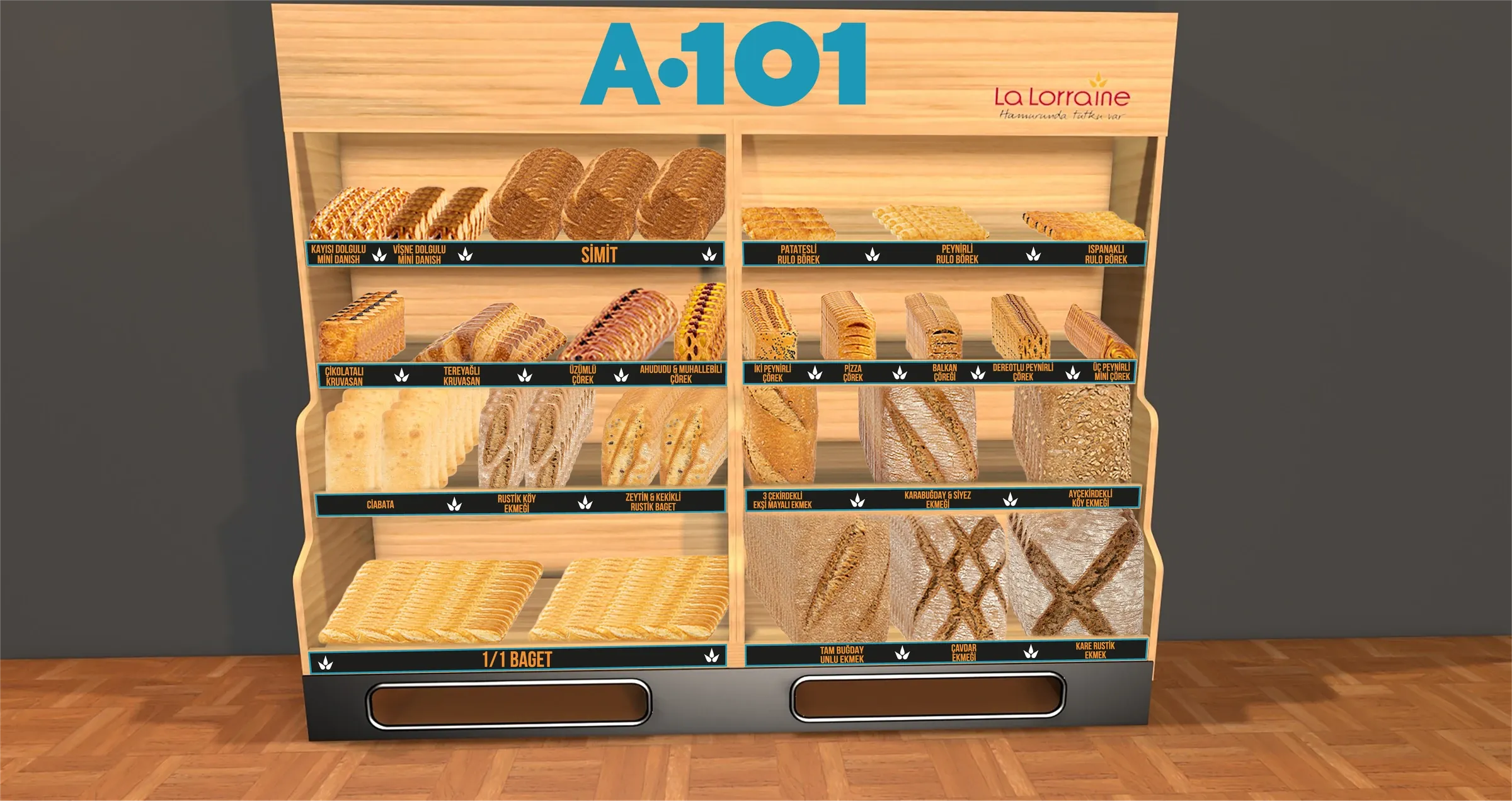
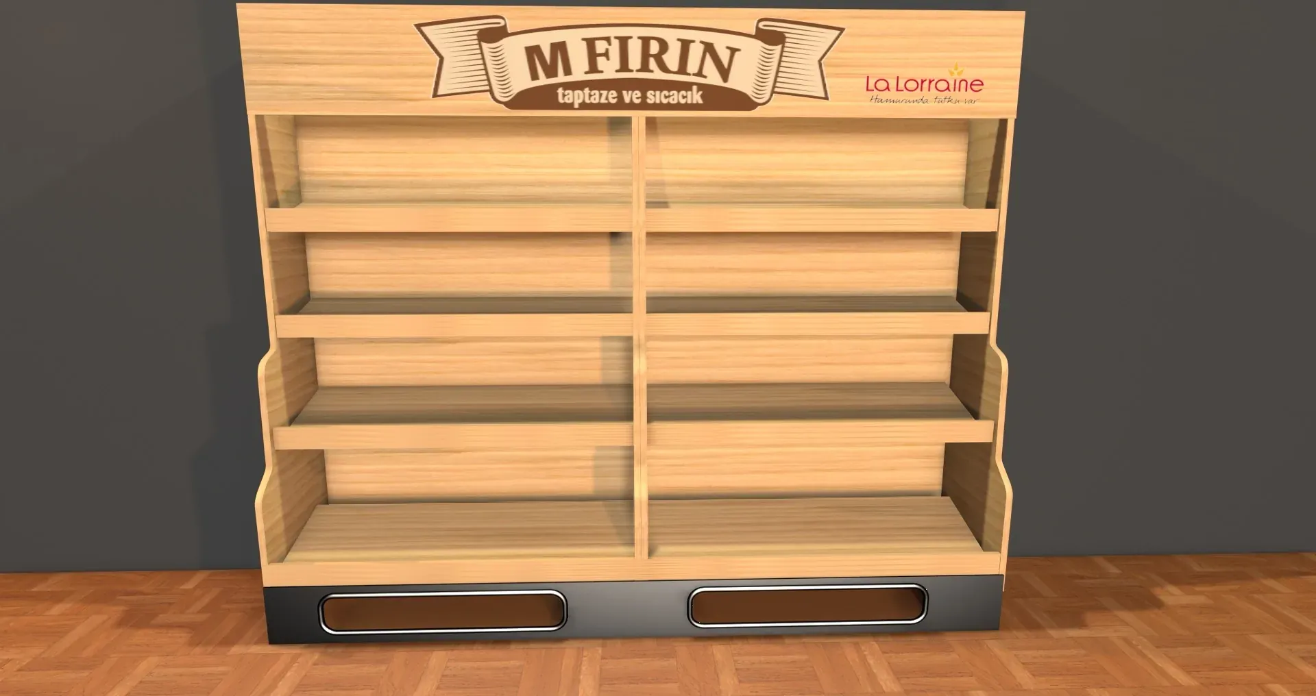
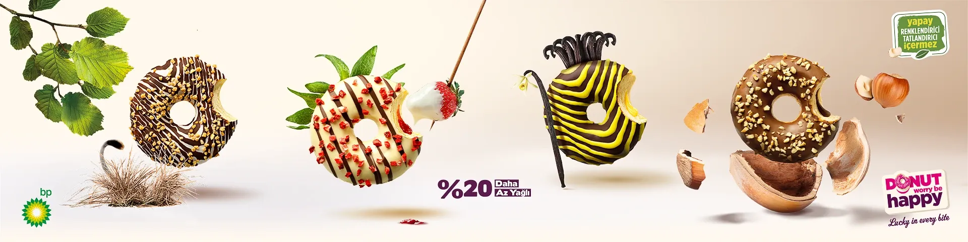
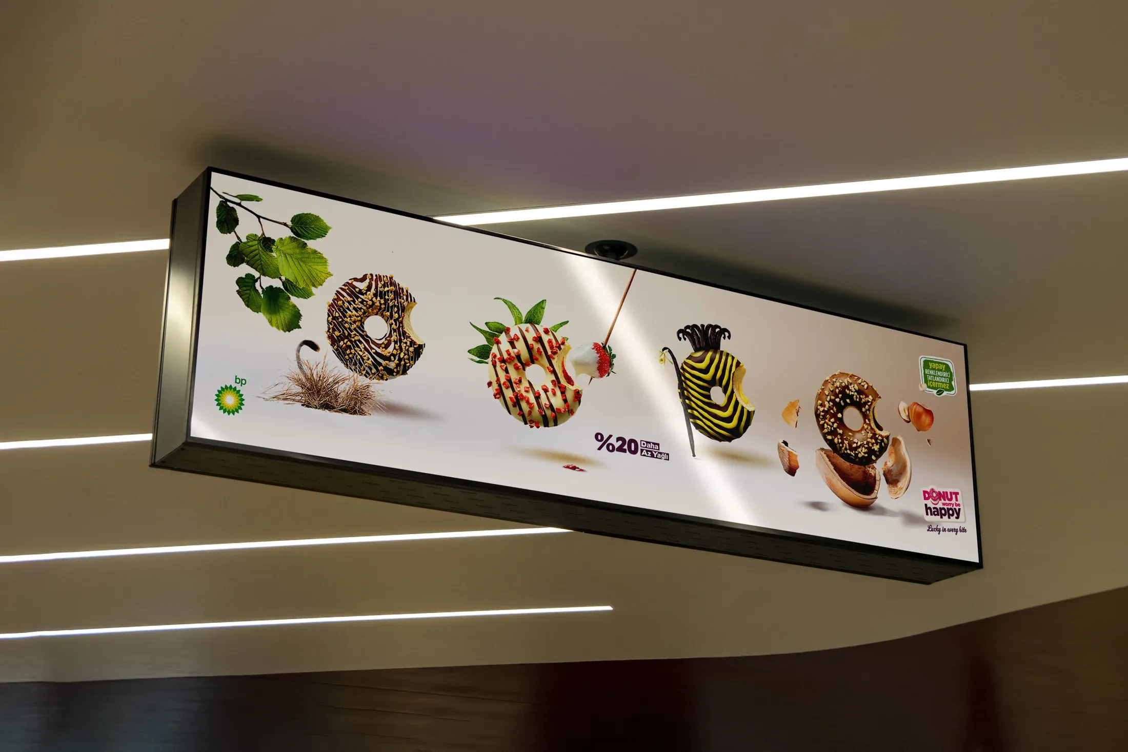
Across Migros, M Fırın, A101, BP and Migros Sanal Market, I adapted La Lorraine and DWBH to modular displays, shelf communication, posters and digital screens without flattening their distinct identities. The same content had to work from a mobile banner to a full retail module, changing hierarchy and composition while retaining brand recognition.
For M Fırın, Migros provided the existing logo and identity. My responsibility was the application design that brought this identity together with La Lorraine within the retail environment.
Adaptation was not resizing. It was preserving the brand while changing the conditions.
11From Screen to Store
The work was built to leave the screen.
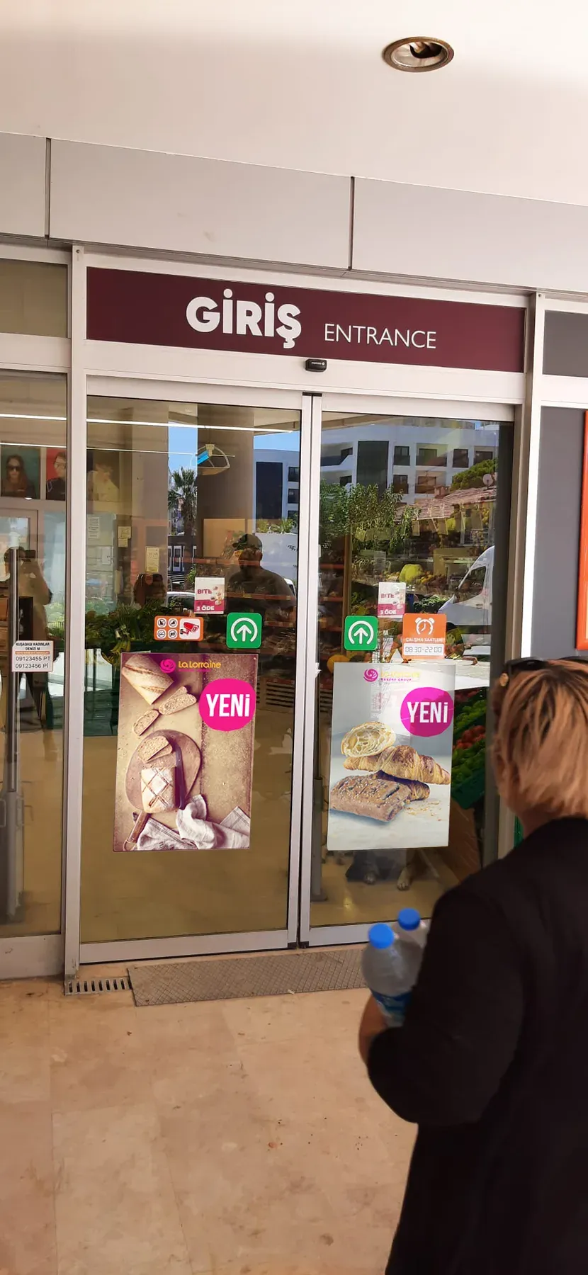
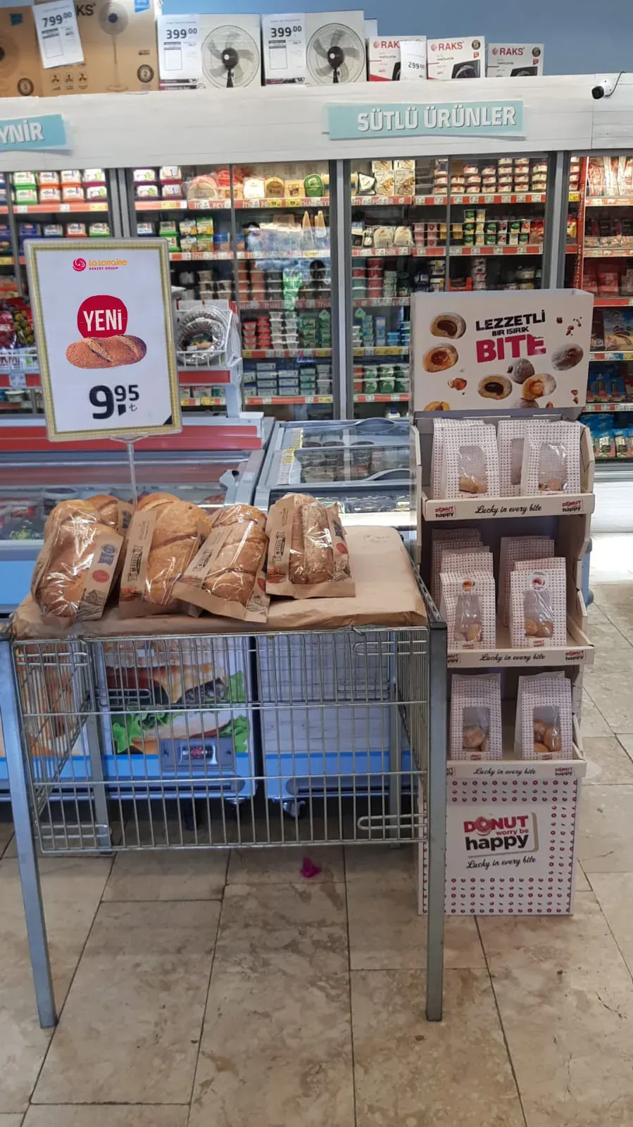
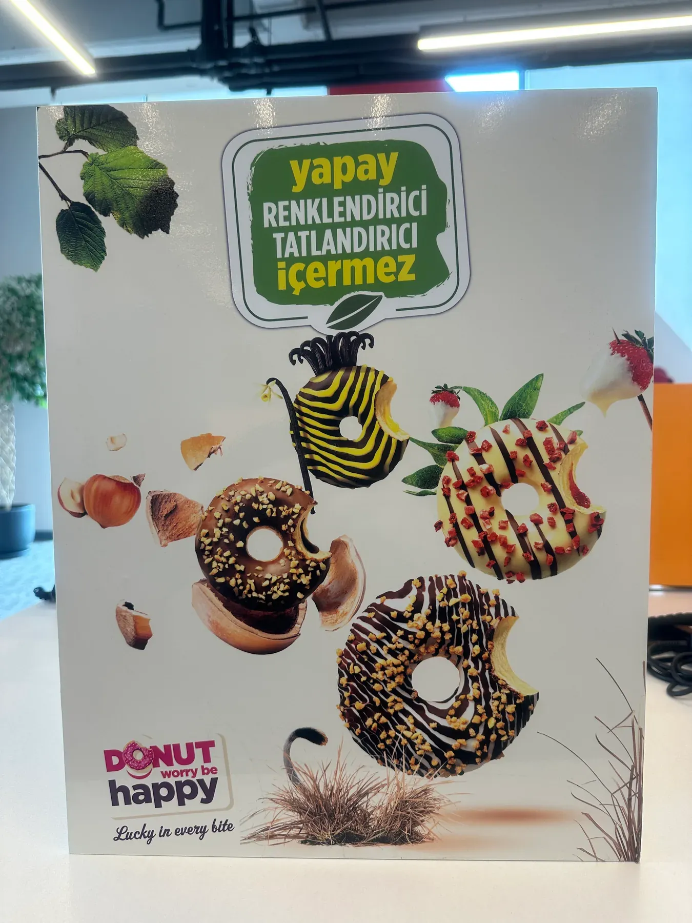
A retail visual only proves itself when it reaches the store. The archive documents the designs in use: La Lorraine new-product communication at a supermarket entrance; La Lorraine sales material and a DWBH product display sharing the same store; and DWBH graphics produced as physical display units.
These applications reveal the final layer of the process: working with real surfaces, sightlines, product density, retailer branding and variable in-store conditions. I carried the designs through production and implementation, checking that each brand remained clear once the work entered the environment it was designed for.
From artwork to store, the system had to survive reality.
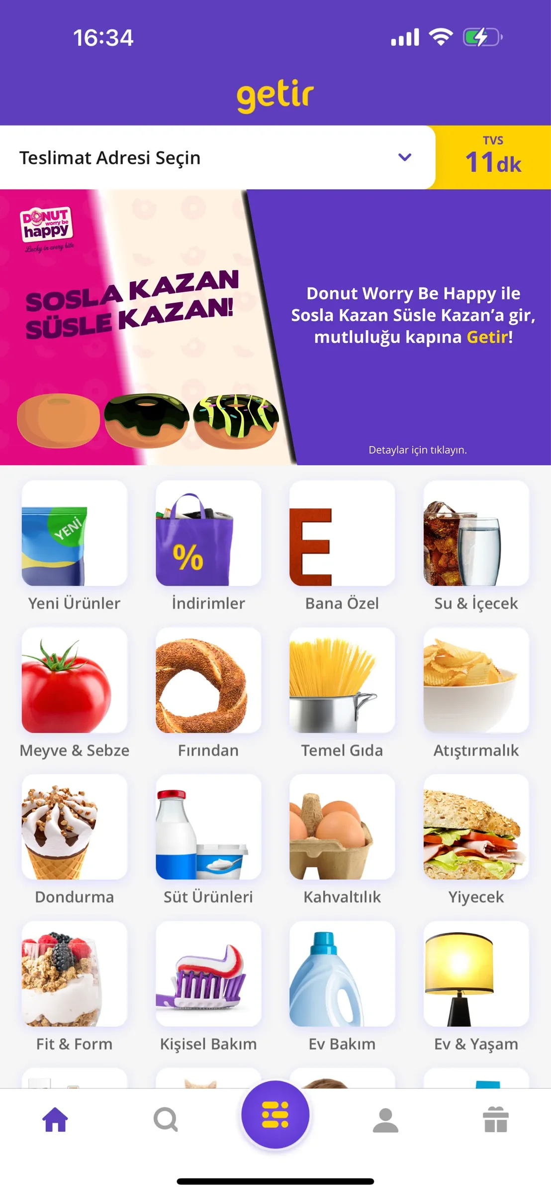
12Getir — Sosla Kazan, Süsle Kazan
Turning a campaign idea into a playable journey.
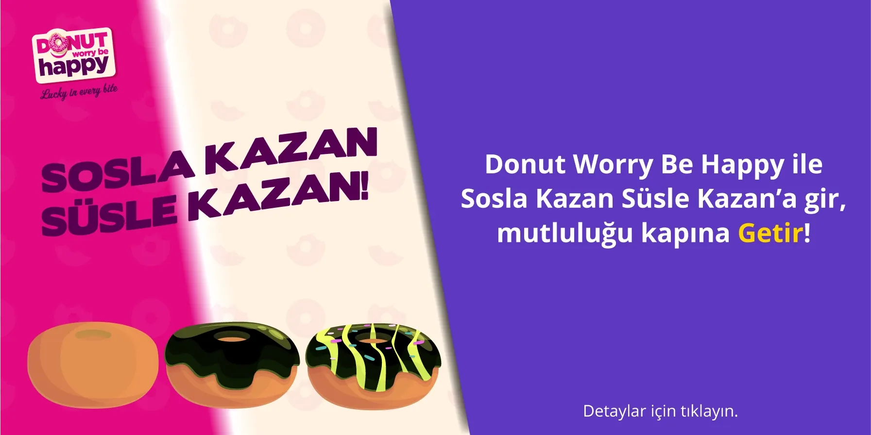
For Getir, Sosla Kazan, Süsle Kazan was developed as a collaborative activation concept with Gökçe Çark. The core game mechanic originated with Gökçe; I contributed to the development of the idea and was responsible for refining the experience, building its visual system, executing the campaign assets and designing the presentation.
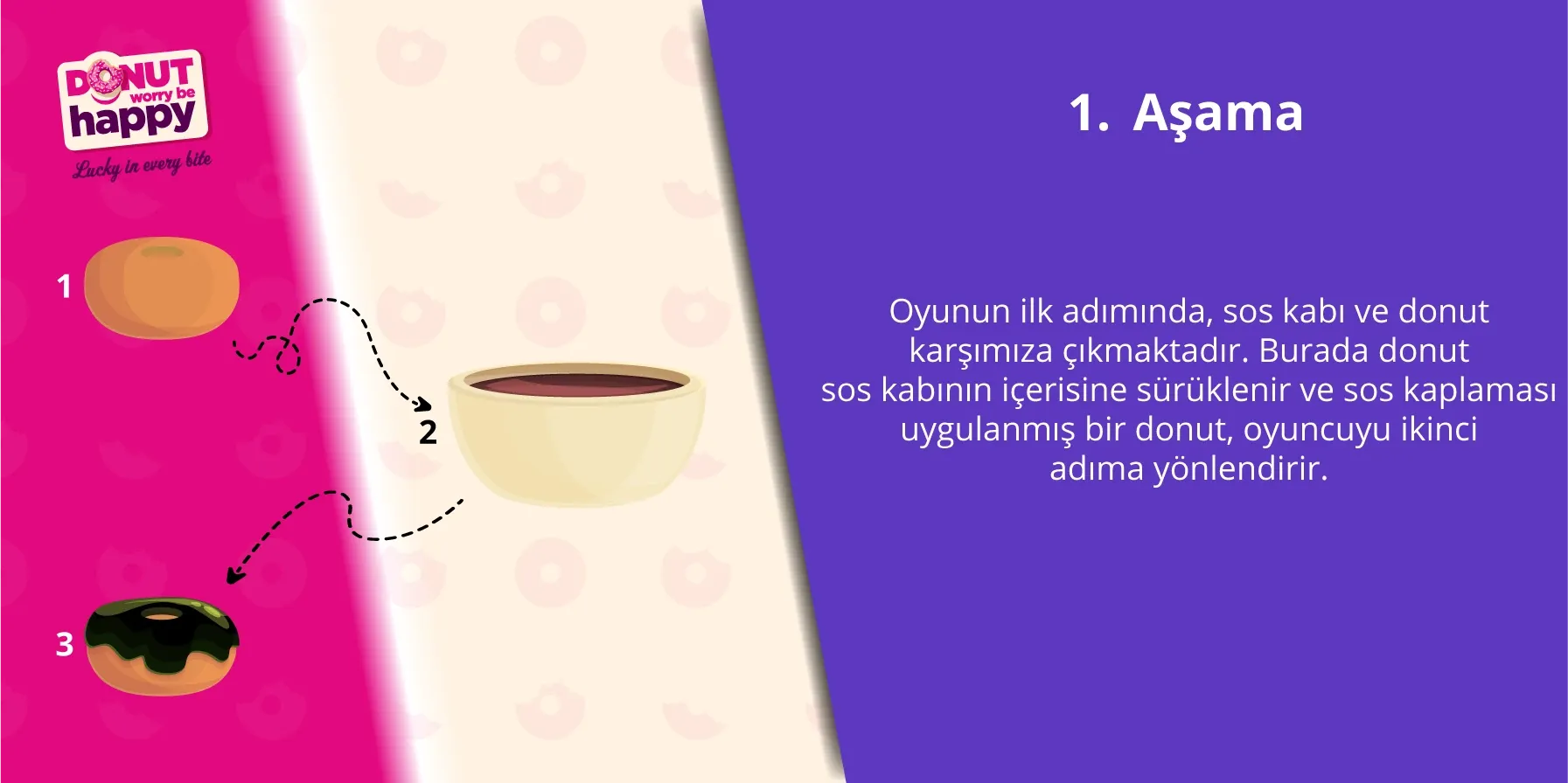
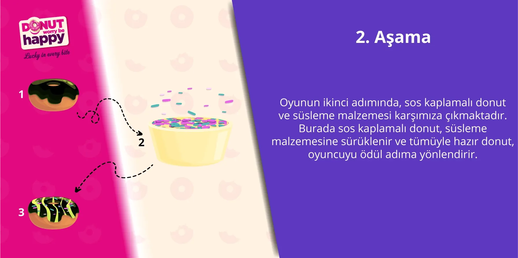
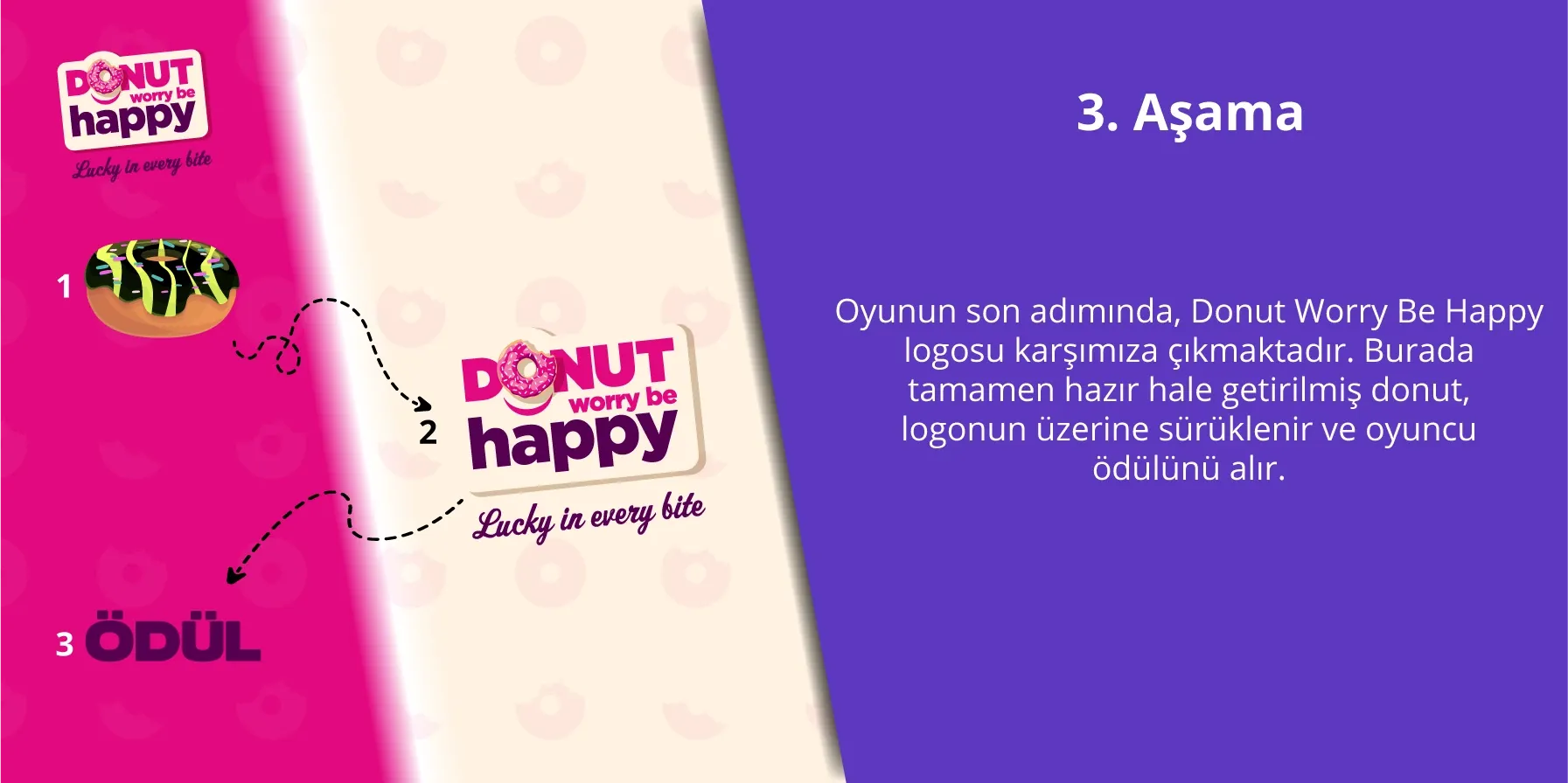
The proposed journey translated DWBH’s playful character into three clear steps: coating the donut with sauce, decorating it with toppings, and completing the interaction to reach the reward. I visualised both the step-by-step game flow and how the activation could enter Getir through an in-app banner.
The final presentation to Getir was delivered by Gökçe Çark.
Collaborative concept with Gökçe Çark. Core game mechanic by Gökçe Çark. Experience refinement, visual system, campaign execution and presentation design by Efe Can Akar. Presentation delivered by Gökçe Çark.
The value was not a single banner. It was a simple mechanic made clear, branded and ready to present.
Sauce → Decorate → Reward
13Brand Experiences Beyond Campaigns
The brand also had to work between campaigns.
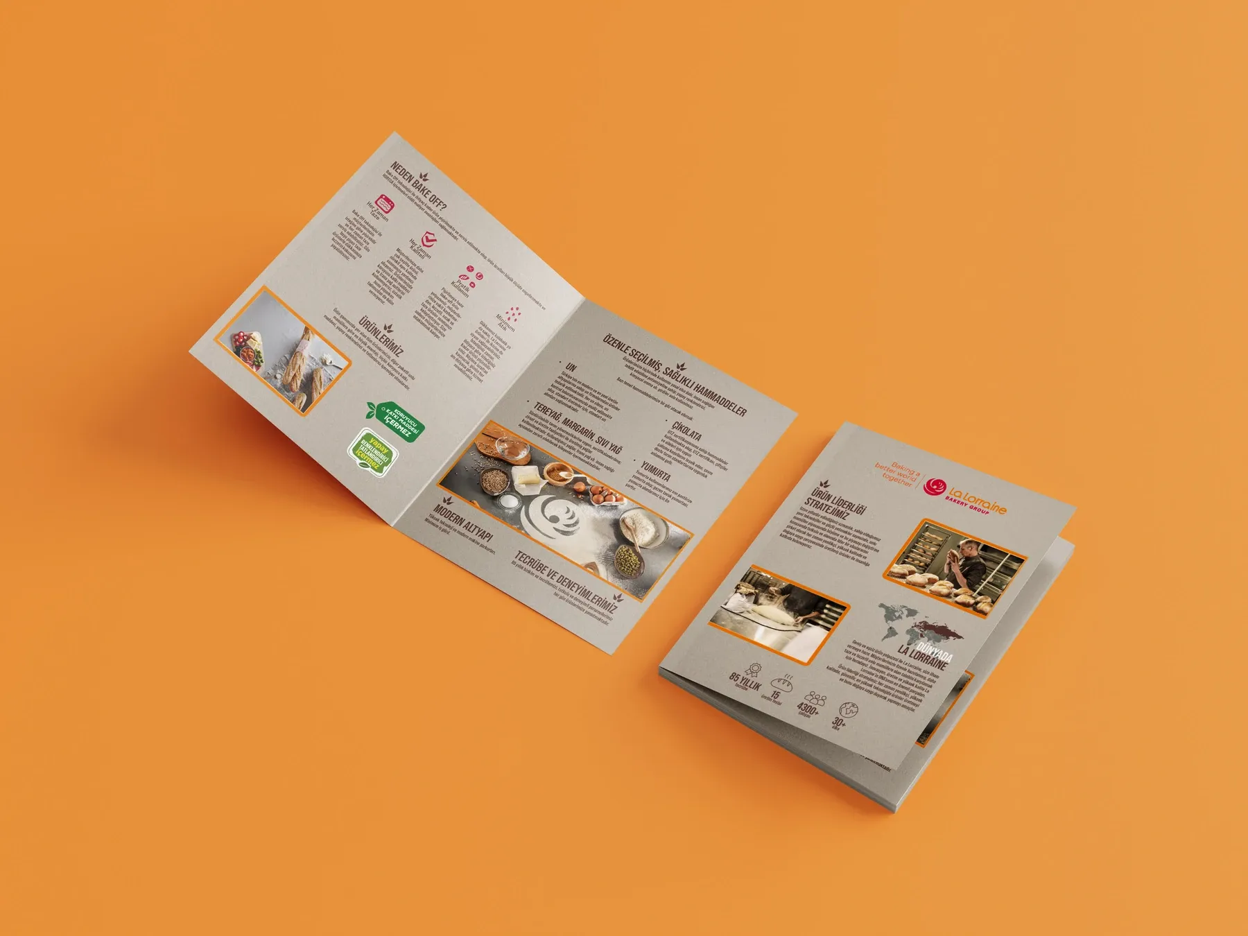
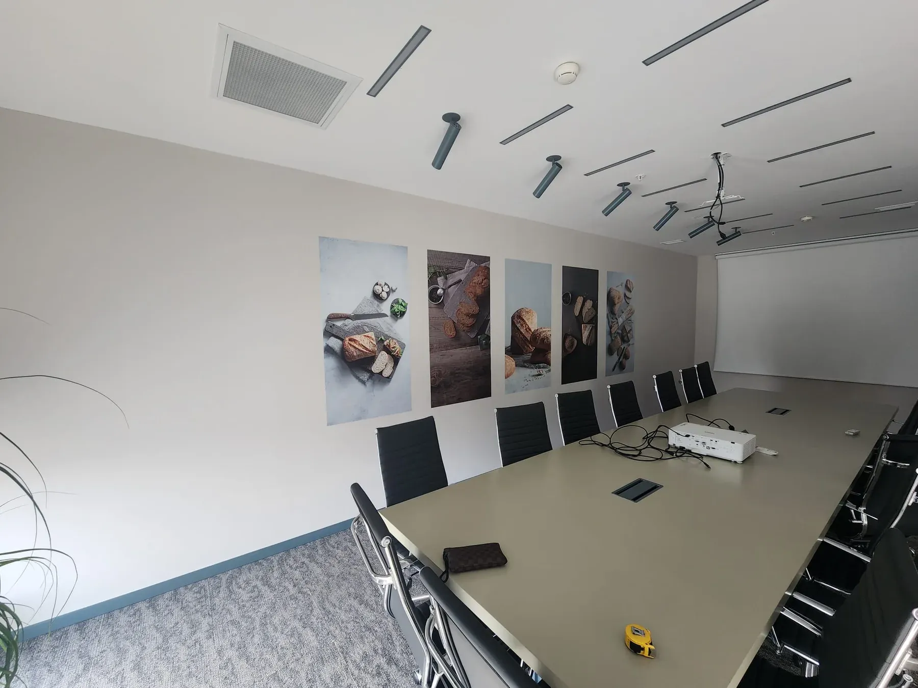
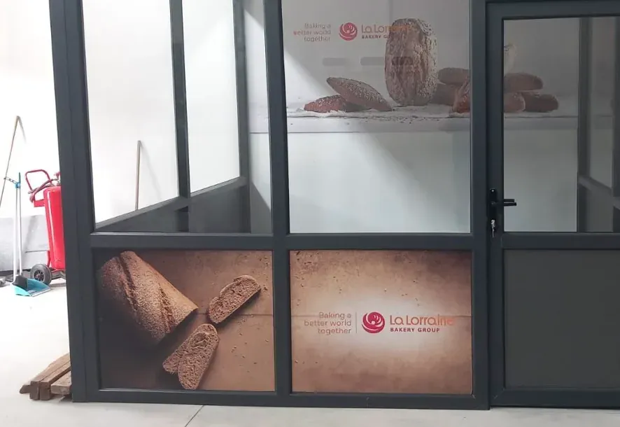
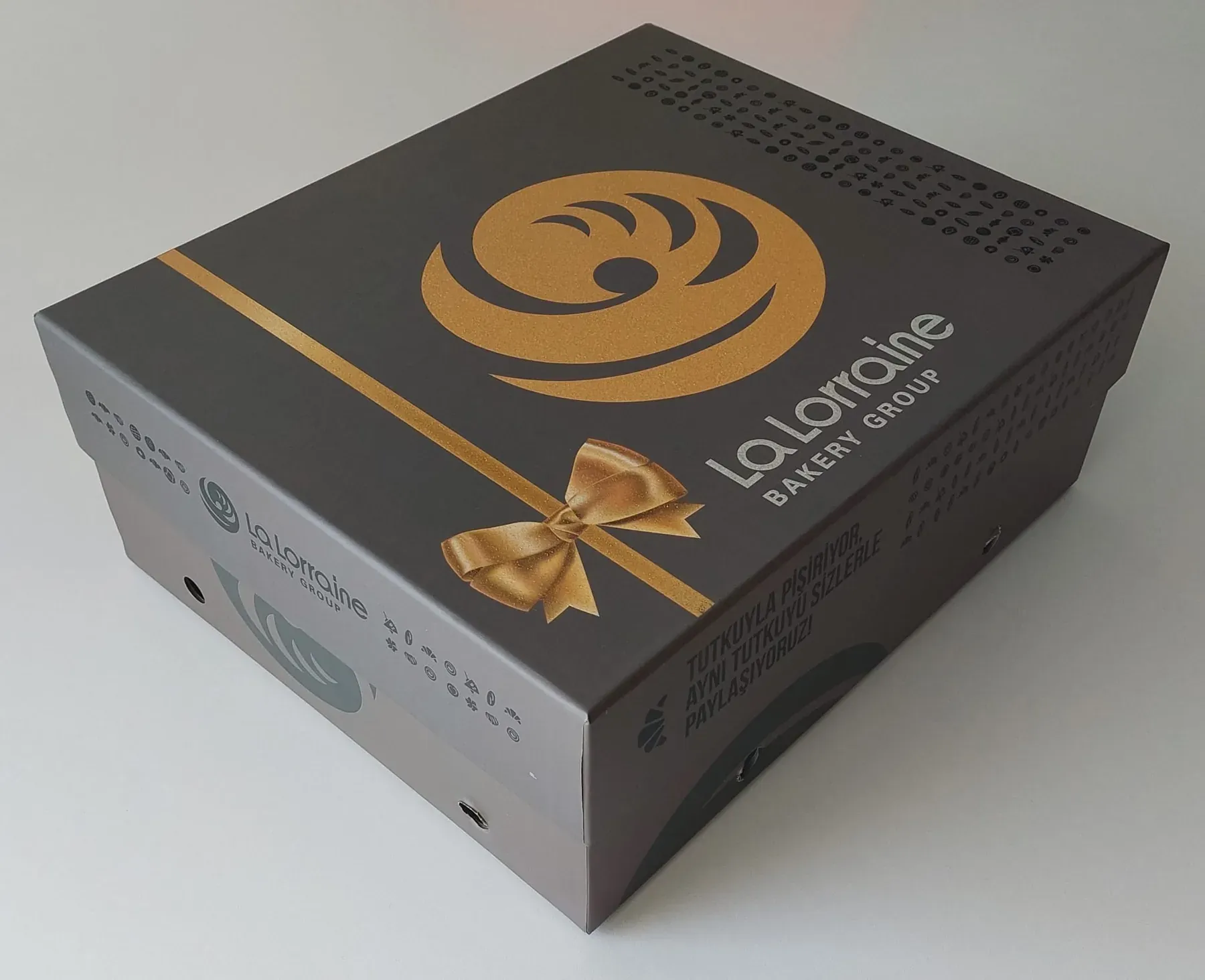
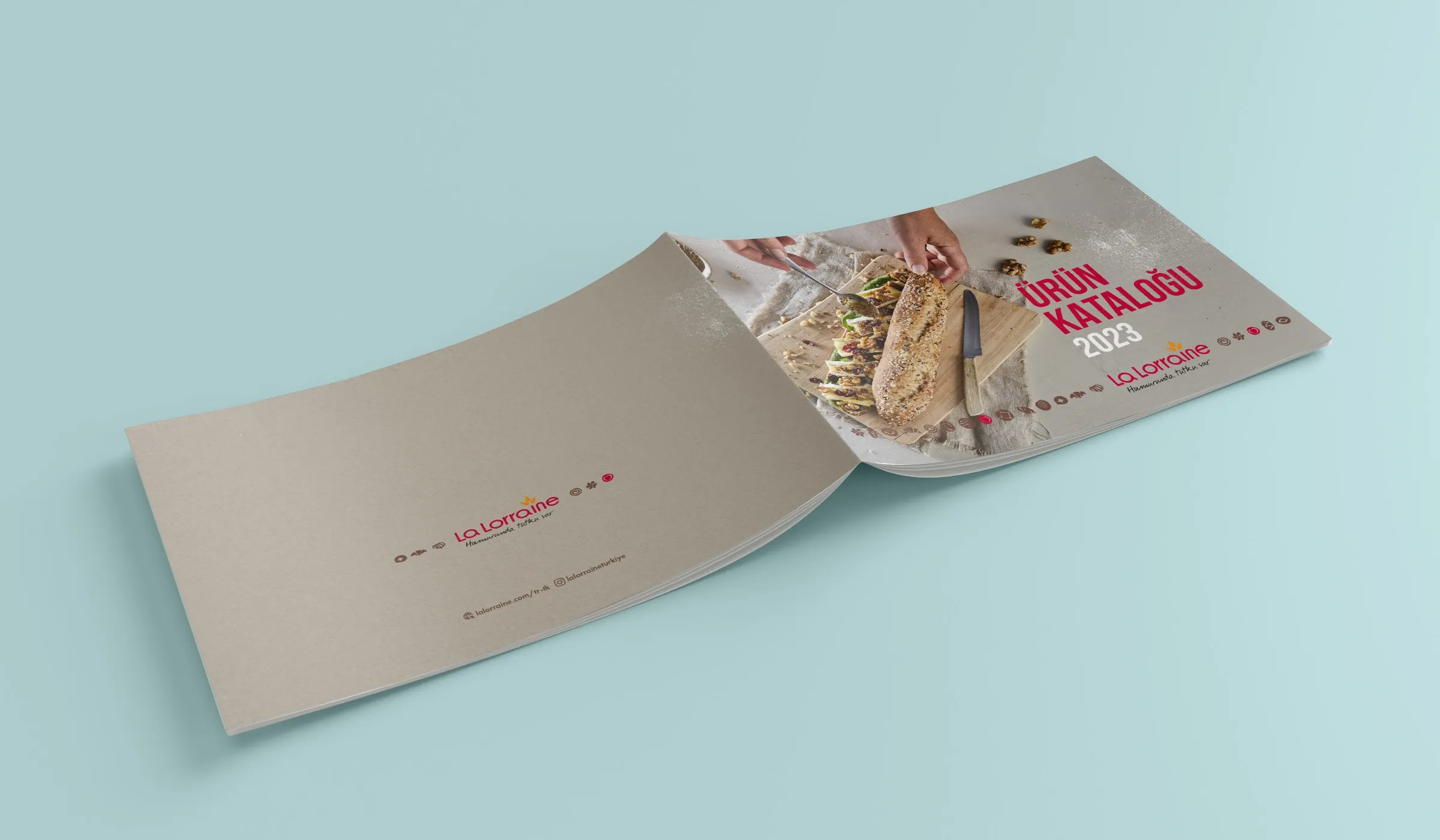
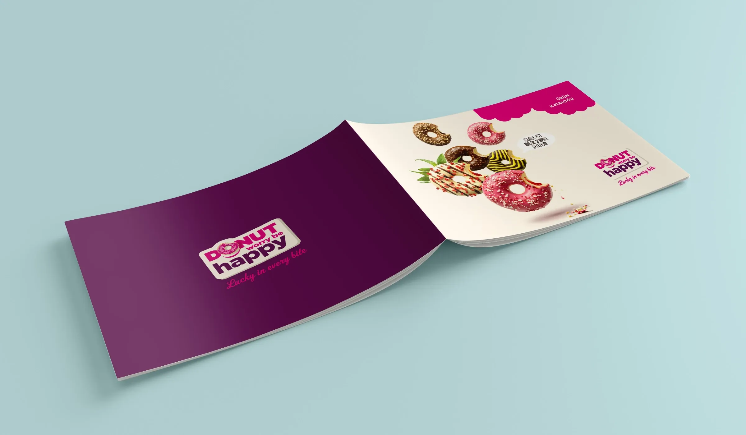
Beyond the flagship campaigns, I designed the materials that supported how LLBG presented itself to teams, distributors and business partners: product catalogues, headquarters graphics, distributor interiors, seasonal gift packaging and B2B presentation materials.
These were quieter touchpoints, but they demanded the same consistency. For the headquarters graphics, I handled image selection, cropping and composition, sizing, design and print preparation. For the year-end gift box, I created the graphic and surface system for a standard structural format. Catalogues and distributor applications extended each brand’s visual language into day-to-day commercial use.
Not every brand experience is a campaign. Consistency is often built in the spaces and materials people use every day.
14Outcome & Credits
The clearest outcome was continued trust.
Across an 18-month collaboration, my role extended across two B2B brands and a wide range of commercial contexts in Turkey, the Caucasus and Central Asia, from campaign concepts and packaging to events, retail environments and production.
The strongest evidence of the relationship was its continuity. After I left Bal Agency in November 2023, LLBG continued working with me directly as an independent creative partner until July 2024.
I do not measure this outcome through sales or growth claims I cannot substantiate. It is visible in the breadth of responsibility I was given, the work that reached production and physical environments, and a client relationship that continued beyond the original agency structure.
Consistency at scale became a working relationship built to last.
- February 2023 – July 2024
- Two B2B brands
- Turkey · Caucasus · Central Asia
Credits
- Client:
- La Lorraine Bakery Group
- Brands:
- La Lorraine; Donut Worry Be Happy
- Role:
- Marketing Art Director — embedded via Bal Agency; later Independent Creative Partner
- Period:
- February 2023 – July 2024
- Regions:
- Turkey, the Caucasus and Central Asia
- Regional Marketing Director:
- Eray Şahinbay
- Creative direction, design and execution:
- Efe Can Akar
- Core scope:
- Campaigns, event identity, packaging, prepress, retail and environmental applications, digital screens, B2B sales materials, presentations, and production and supplier coordination
Specific contribution boundaries
- Yeni Yayın Dönemi:
- Creative concept, visual identity, print and environmental applications by Efe Can Akar. Product launch platform visual arrangement and product presentation by Efe Can Akar; structural design developed externally.
- Onsuz Olmaz!:
- Campaign platform developed collaboratively by Efe Can Akar, Bal Agency and LLBG Marketing. Contextual message variations and visual execution by Efe Can Akar; approval and feedback by Eray Şahinbay.
- DWBH packaging:
- Creative concept, package layout, artwork and prepress by Efe Can Akar.
- Getir — Sosla Kazan, Süsle Kazan:
- Collaborative concept with Gökçe Çark. Core game mechanic by Gökçe Çark. Experience refinement, visual system, campaign execution and presentation design by Efe Can Akar. Presentation delivered by Gökçe Çark.
- Product photography:
- Produced by Food Art Studio. Moodboard direction, on-set participation and post-production selection by Efe Can Akar.
- M Fırın:
- Existing logo and identity supplied by Migros. Retail application design by Efe Can Akar.
- Year-end gift box:
- Graphic design and surface system by Efe Can Akar. Standard structural format not claimed as original structural design.