01 PIN DRINKS
Rebuilding a beverage brand for clarity, distinction and scale.
A packaging-led brand transformation across multiple flavours, formats and commercial touchpoints.
02
Overview
When I joined Pin Drinks, the brand was working with a limited packaging system built around its existing 250 ml glass bottles and 1 L PET range.
An urgent need to update the packaging became an opportunity to rethink the brand more broadly: how it could stand apart in a visually crowded category, communicate more clearly on shelf, and expand consistently across new products and production formats.
I developed a new visual system built around a predominantly white canvas, strong flavour coding, custom fruit illustrations and a clearer information hierarchy.
The system ultimately covered 12 packaging SKUs designed from the ground up, 2 existing SKUs revised, and 2 additional packaging designs developed under my creative direction, spanning PET bottles, glass bottles and aluminium cans.
Beyond packaging, the identity extended into retail, e-commerce, outdoor, events, social content and campaign production.
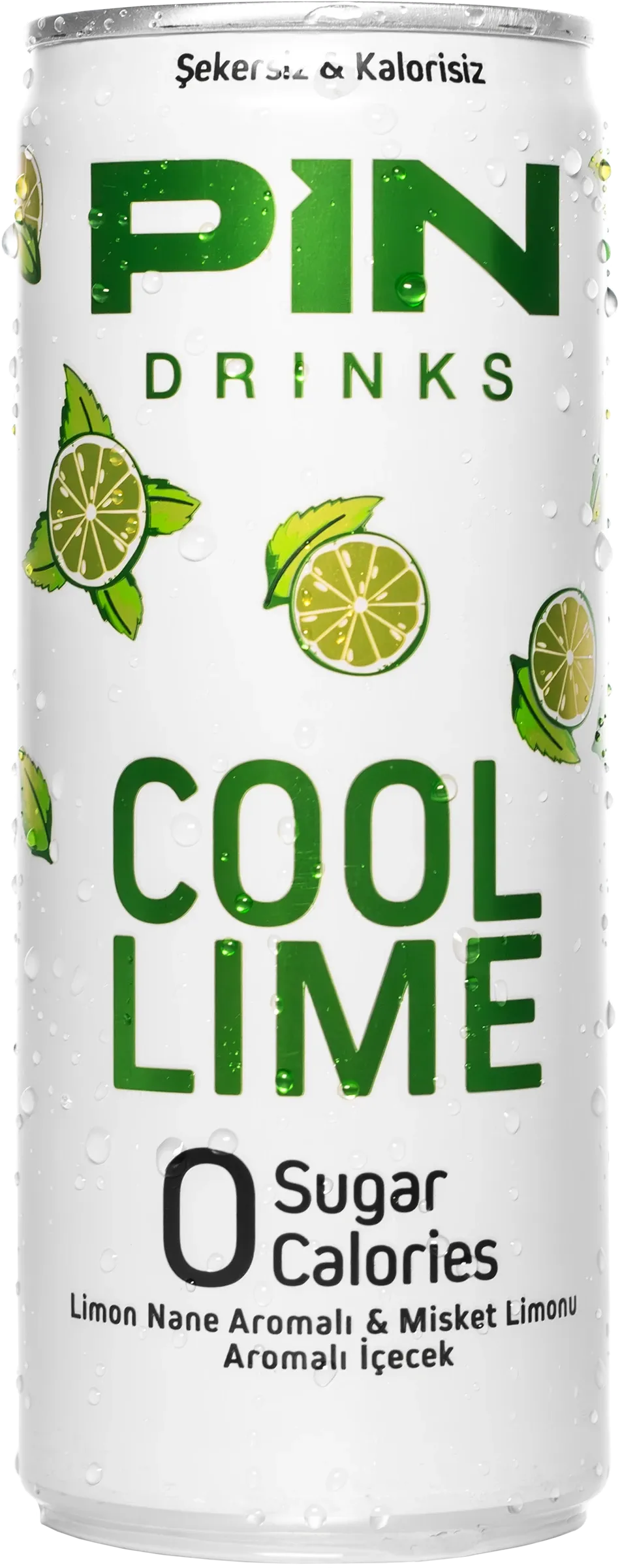
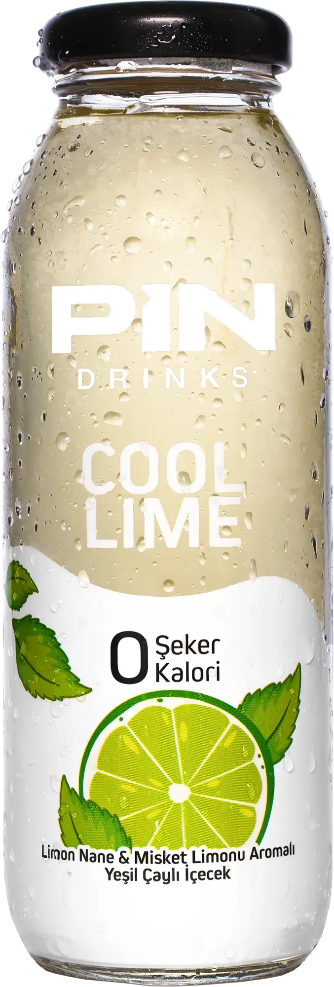
Cool Lime
250 ml can · 250 ml glass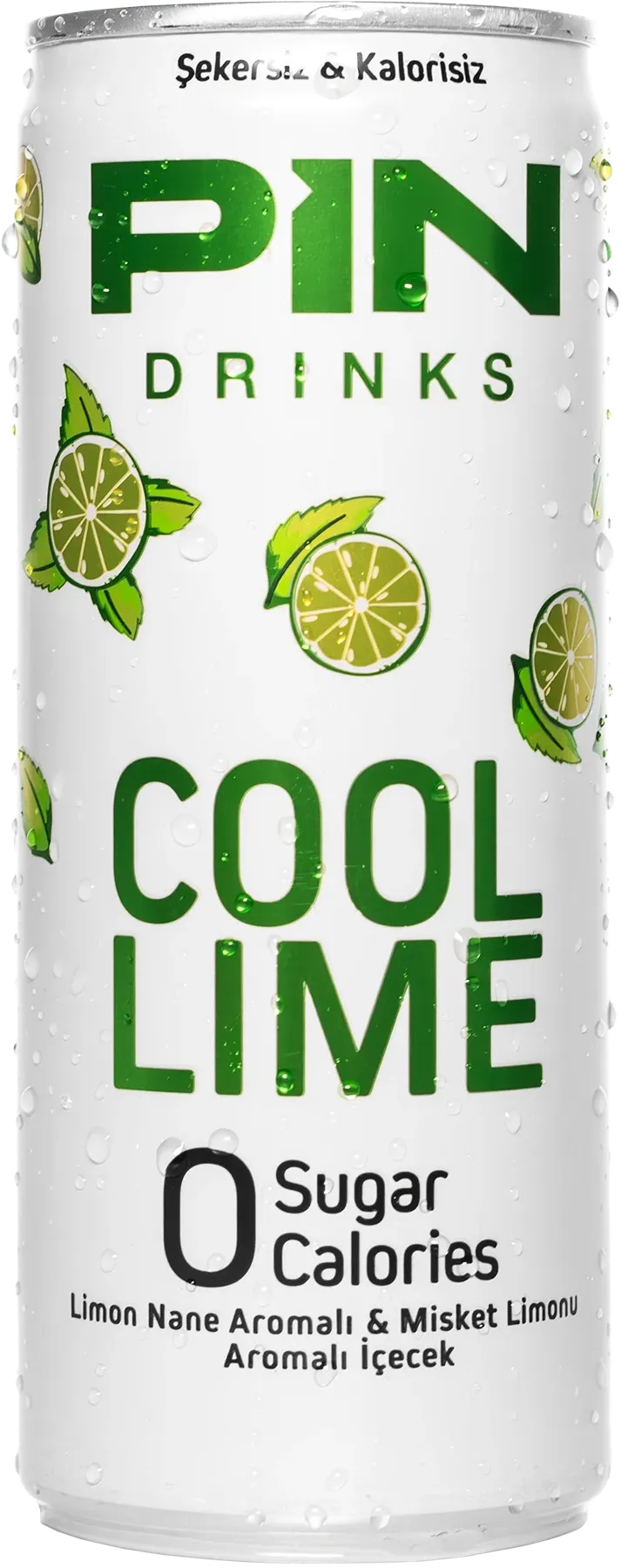
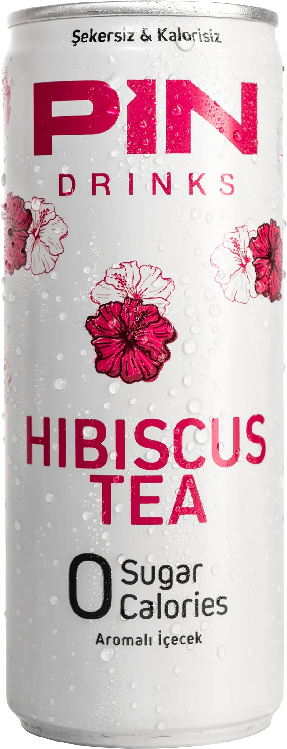
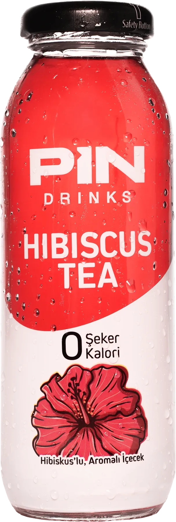
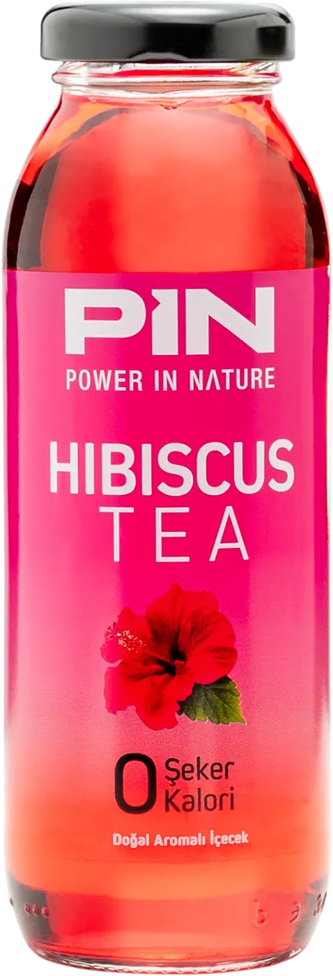
Hibiscus
250 ml can · 250 ml glass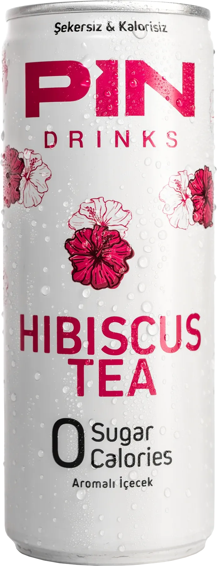
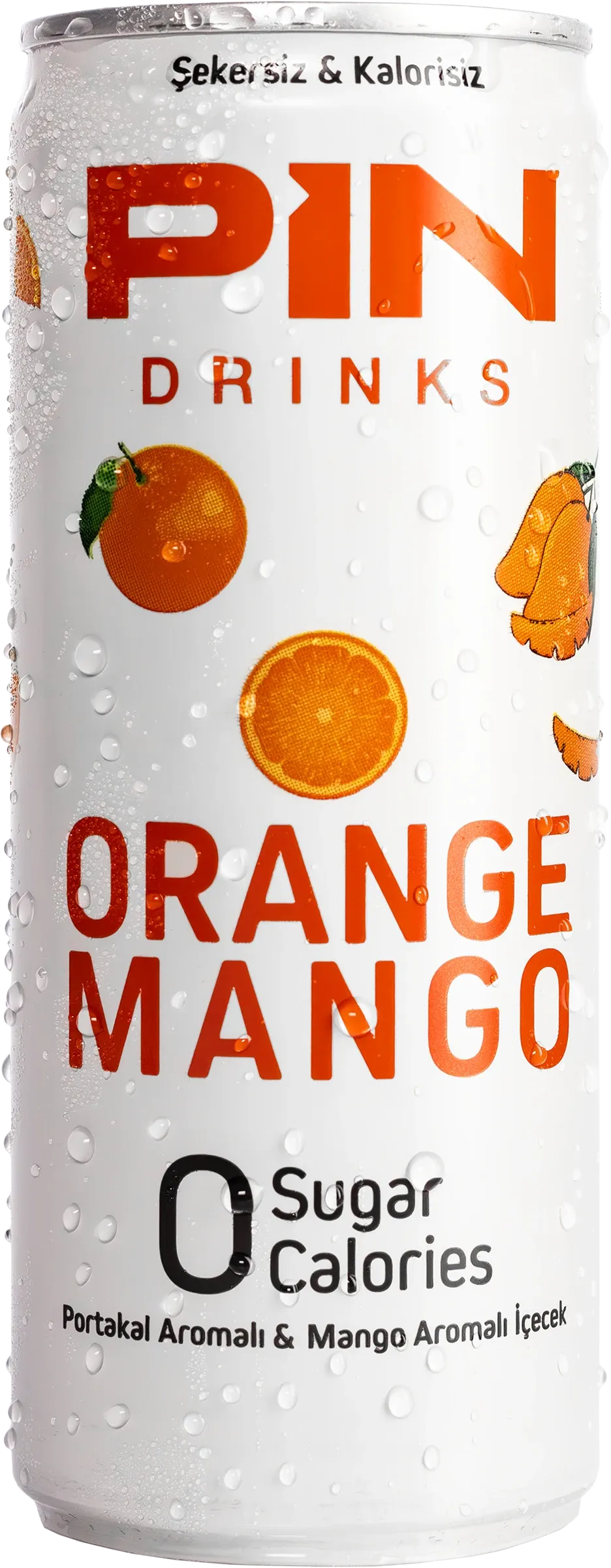
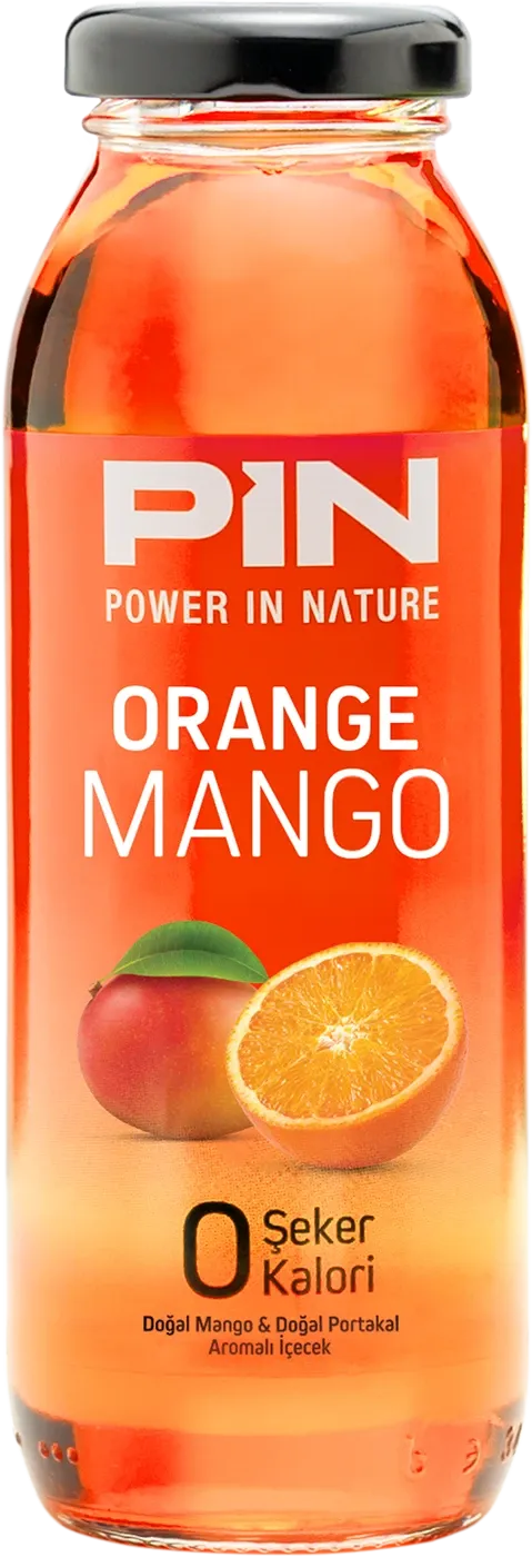
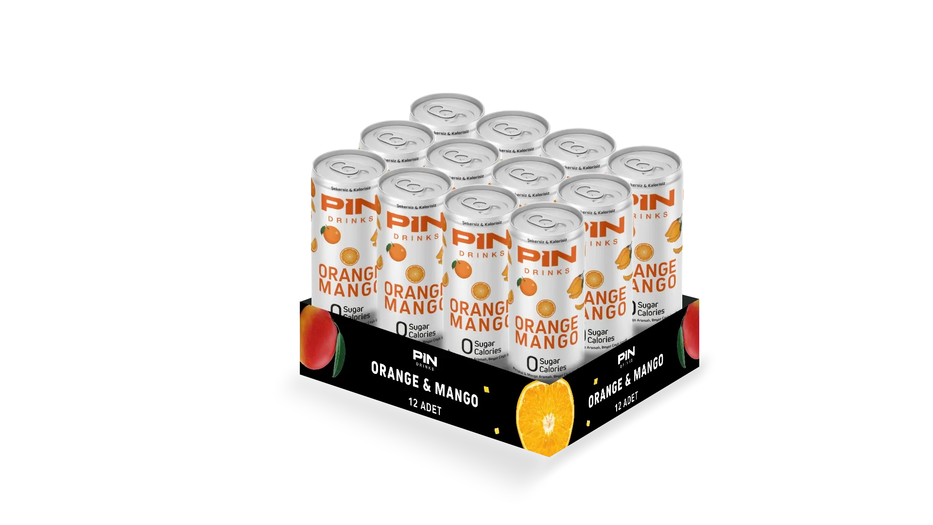
Orange Mango
250 ml can · 250 ml glass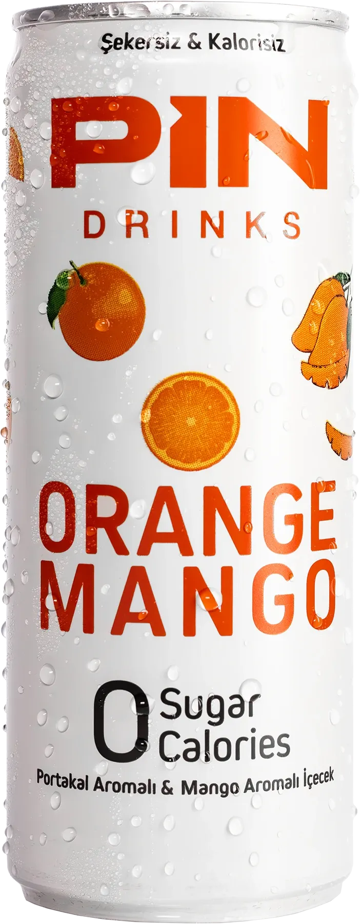
- Packaging SKUs
- 16 12 designed from the ground up · 2 revised · 2 developed under Creative Direction
- Production Formats
- 3
- Markets During Engagement
- 4
- Creative Leadership
- Nov 2023 to Jul 2024
03 The Challenge
A necessary update exposed a bigger brand problem.
Pin Drinks' existing packaging needed urgent updates, but the challenge went beyond correcting individual labels.
The visual language had become fragmented across products and formats. In a category already crowded with strong colours, gradients and competing claims, the brand lacked a clear system that could create distinction on shelf while remaining flexible enough to support future products.
The task was therefore not simply to redesign a few packages. It was to establish a more coherent visual foundation for the brand.
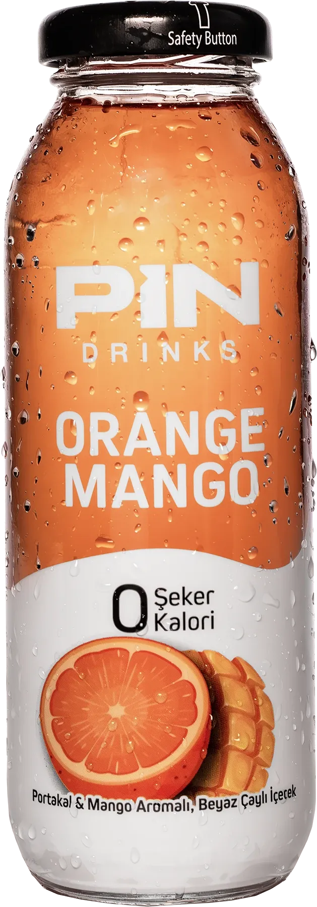
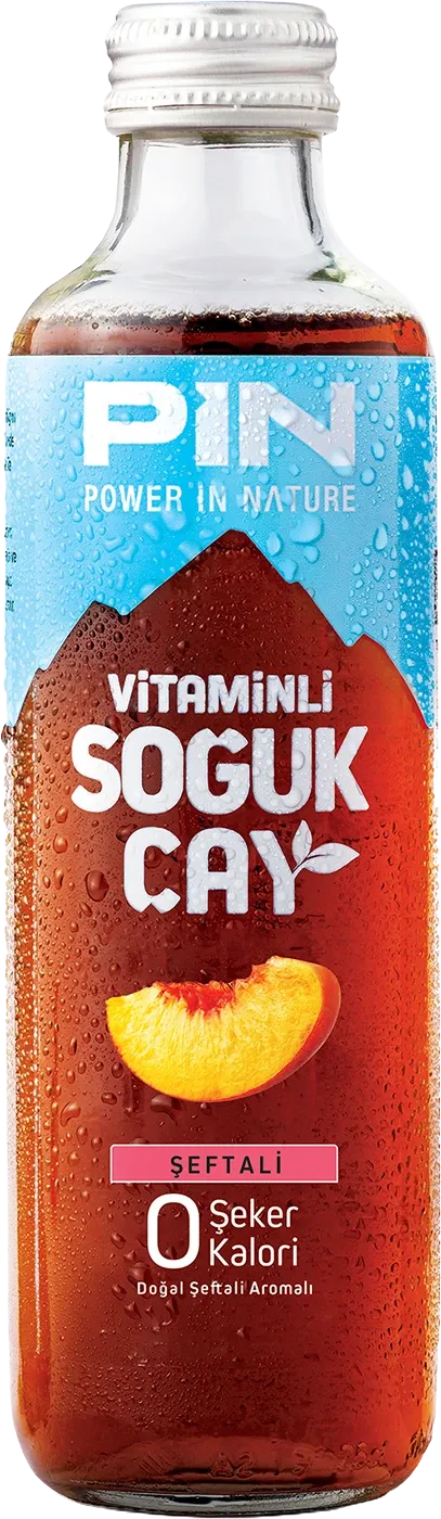
The existing system relied heavily on flavour-specific colour fields and varied visual treatments, making it difficult to establish a consistent family presence across the range.
Before
04 Strategic Opportunity
Turn a packaging requirement into a visual reset.
Rather than treating the required updates as isolated production tasks, I used them as an opportunity to reconsider how Pin could behave as a brand across an expanding portfolio.
The goal was to create a system that could do three things consistently:
This became the foundation for the new packaging system and the wider visual direction of the brand.
- 01 Distinction
Establish stronger distinction in a visually crowded category.
- 02 Hierarchy
Create a clear hierarchy between brand, flavour and product claims.
- 03 Adaptability
Adapt across glass bottles, PET bottles and aluminium cans without losing its identity.
05 Less Colour. More Distinction.
Less colour. More distinction.
The category was already full of packaging competing through saturated colours, gradients and dense visual treatments. Adding more of the same would not make Pin more recognisable.
I chose a predominantly white canvas to reduce visual noise and create a stronger contrast against the category. The direction also supported the brand's existing clean, health-oriented tone without relying on additional visual complexity.
Flavour recognition was preserved through strong colour coding and custom fruit illustrations. This allowed each product to retain its own character while still belonging clearly to the same family.
06 Information Hierarchy
A clearer order of information.
The redesign established a consistent reading sequence across the range:
PIN → Flavour → 0 Sugar / 0 Calories
The brand was given the strongest visual presence, followed by flavour identification and then the product's existing zero-sugar and zero-calorie proposition.
This hierarchy reduced competition between messages and created a structure that could remain consistent as the system expanded across different flavours and packaging formats.
- 01BrandPIN
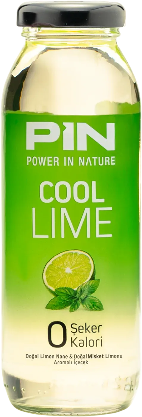
- 02FlavourCool Lime
- 03Product Proposition0 Sugar / 0 Calories
07 Illustration System
Flavour as part of the identity.
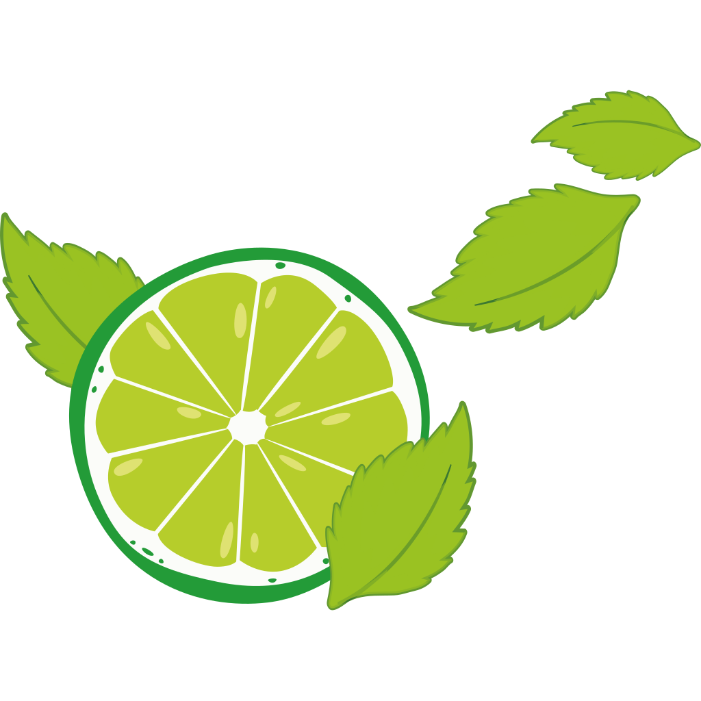
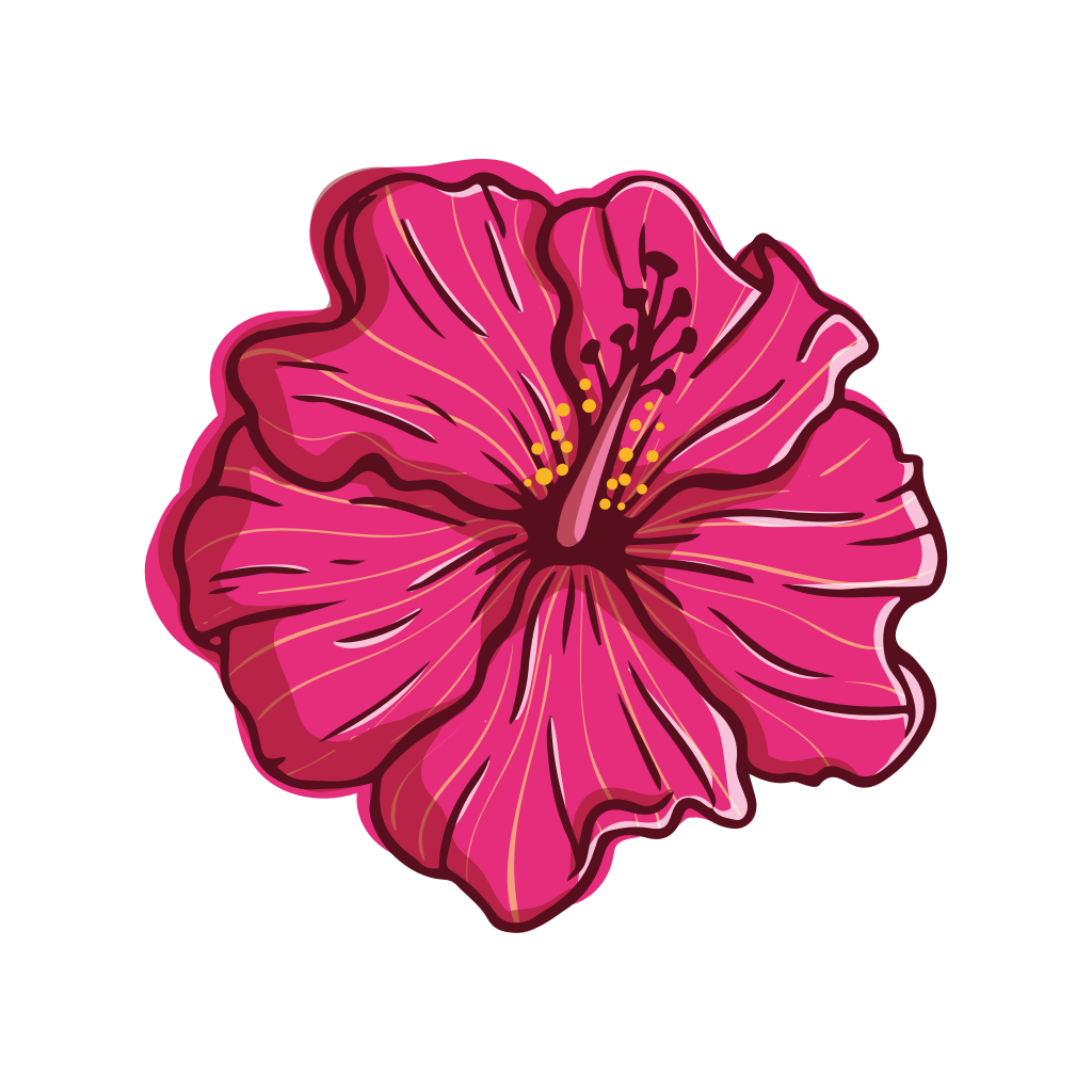
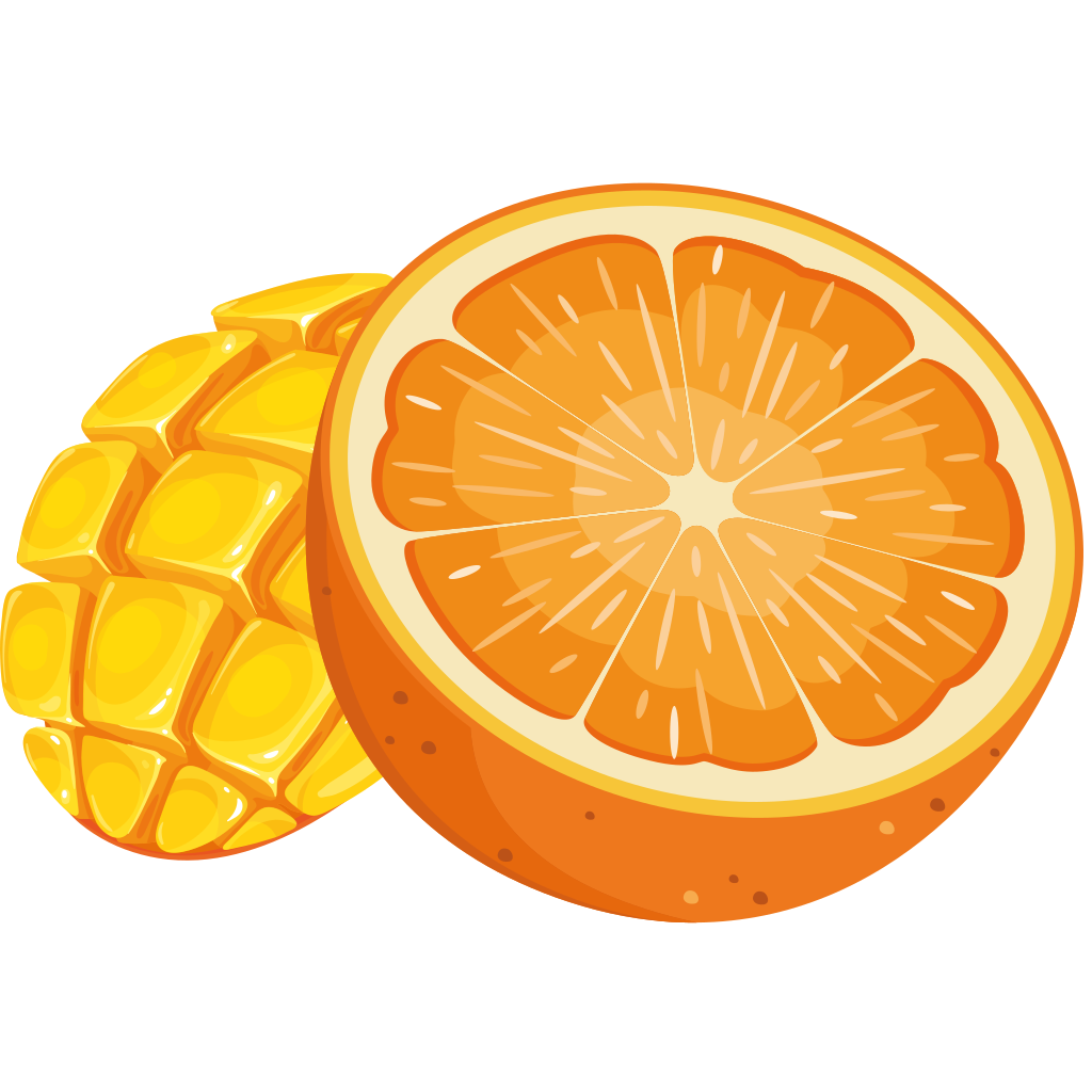
Rather than relying on colour alone to differentiate flavours, I created a custom set of vector fruit illustrations for the packaging system.
Each illustration was developed to give the flavour a recognisable visual signature while working within the same overall composition. Combined with the white canvas and flavour-specific colour coding, the illustrations added character without introducing unnecessary visual noise.
The result was a flexible visual language that could distinguish individual products while maintaining a consistent family presence across the range.
Applied across the system
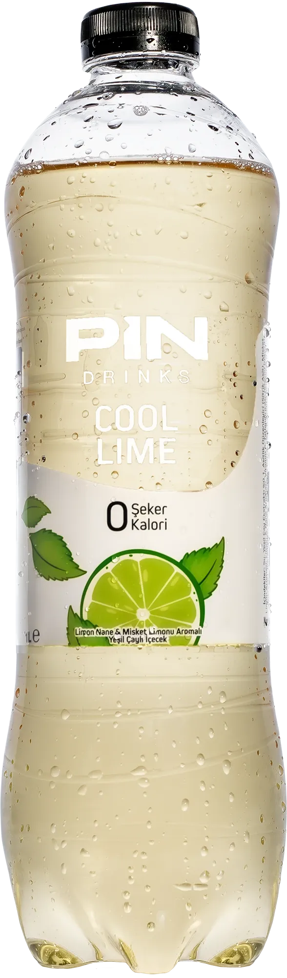
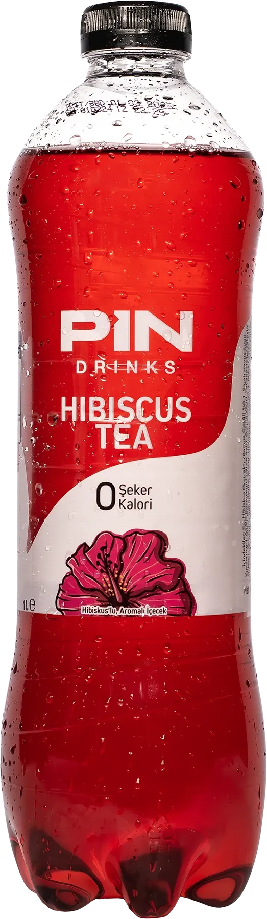
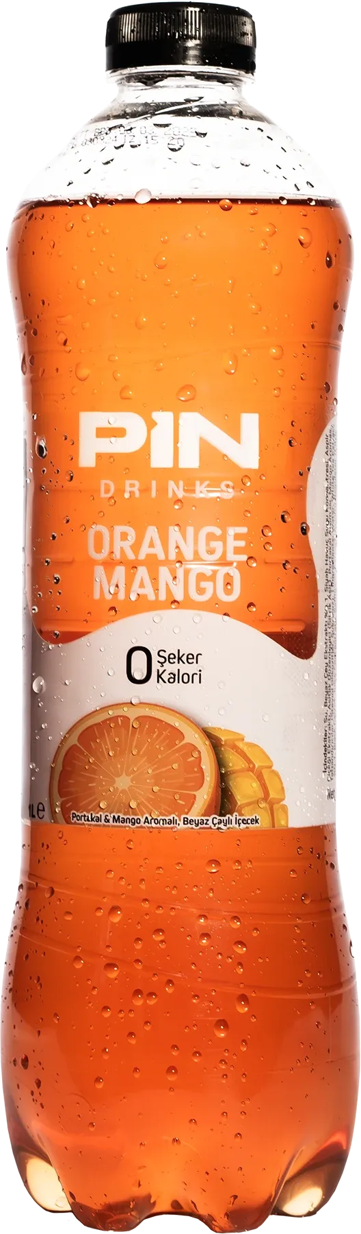
08 One Identity. Three Production Realities.
One identity. Three production realities.
A packaging system only works if it can survive beyond a single format.
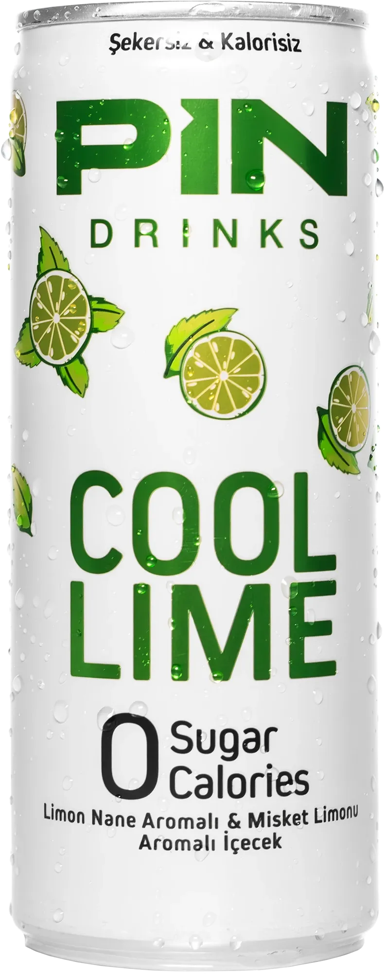
Using Cool Lime as a common reference, I adapted the same visual identity across 1 L PET, 250 ml glass and 250 ml aluminium can packaging.
Each format introduced different proportions, printable areas and technical constraints. The objective was not to make the three packages identical, but to preserve the same hierarchy, flavour recognition and brand character while allowing each format to work within its own production requirements.
This approach established a system that could scale across different packaging structures without losing visual consistency.
09 Full Product Family
Building a system that could grow with the portfolio.
The new visual language was developed as a system rather than a collection of individual package designs.
During my engagement, I designed 12 packaging SKUs from the ground up, covering Cool Lime, Hibiscus, Orange Mango, Peach Ice Tea and Winter Tea across different formats. I also revised 2 existing Ice Tea SKUs and directed the development of 2 additional White Peach packaging designs.
In total, the scope covered 16 packaging SKUs across PET bottles, glass bottles and aluminium cans.
Despite differences in flavour, format and product type, the range was connected through the same core principles: a predominantly white canvas, clear flavour coding, custom fruit illustrations and a consistent information hierarchy.
This made it possible for new products to join the family without requiring a new visual language each time.
Cool Lime
250 ml can · 250 ml glass · 1 L PETHibiscus
250 ml can · 250 ml glass · 1 L PETOrange Mango
250 ml can · 250 ml glass · 1 L PETPeach Ice Tea
250 ml glass · 1 L PET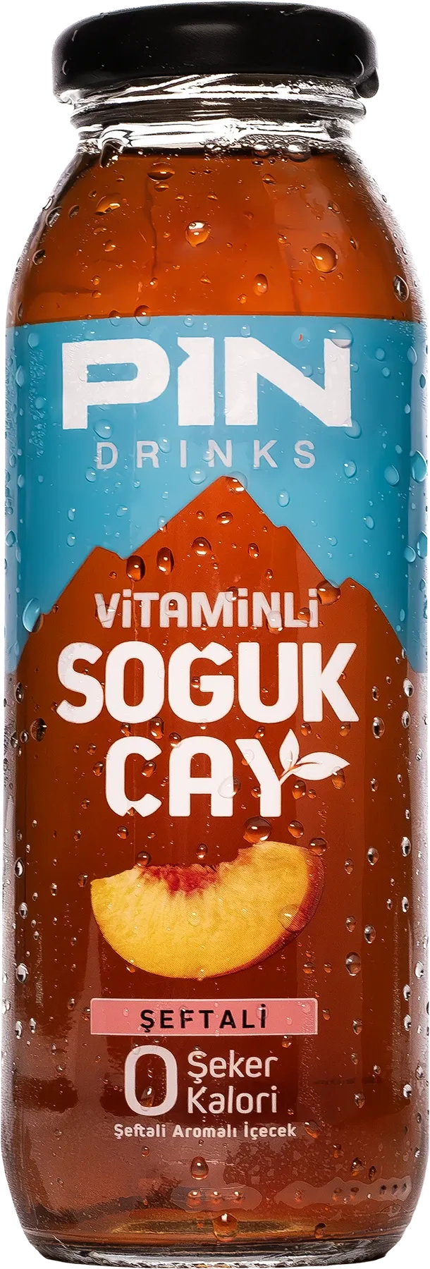
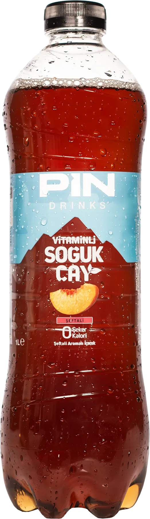
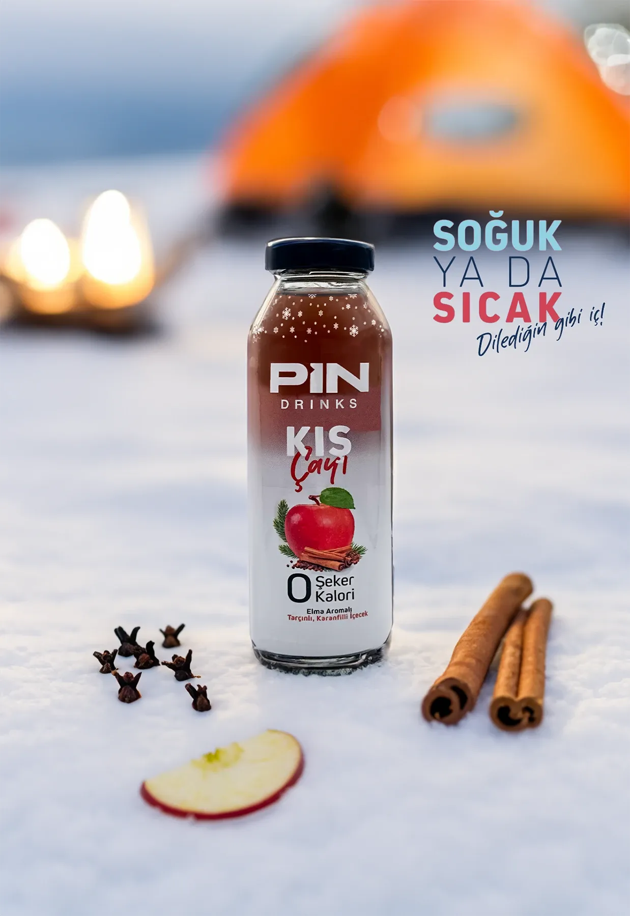
Winter Tea
250 ml glass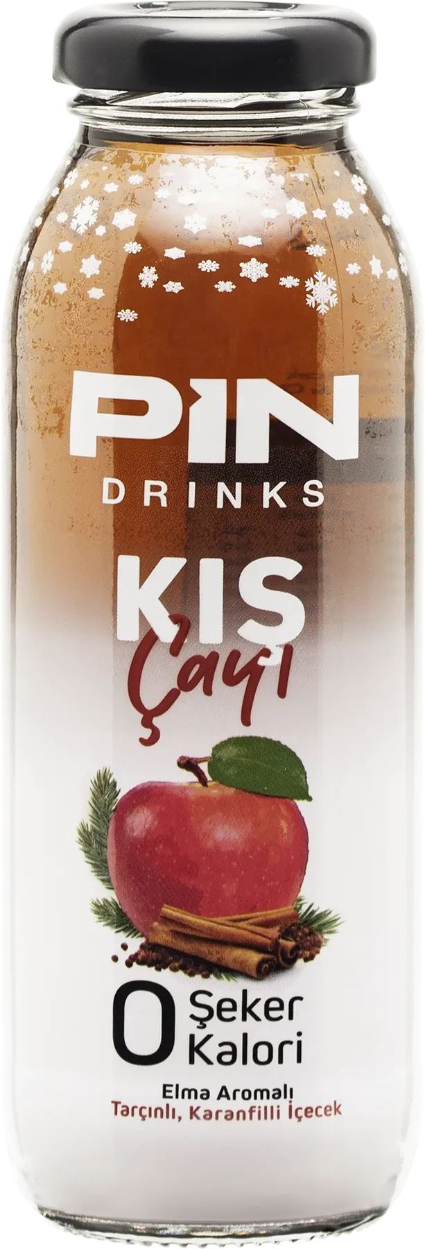
- 16 Packaging SKUs
- 12 Designed from the ground up
- 2 Existing SKUs revised
- 2 Developed under Creative Direction
- 3 Packaging formats
10 From Artwork to Production
Designing beyond the screen.
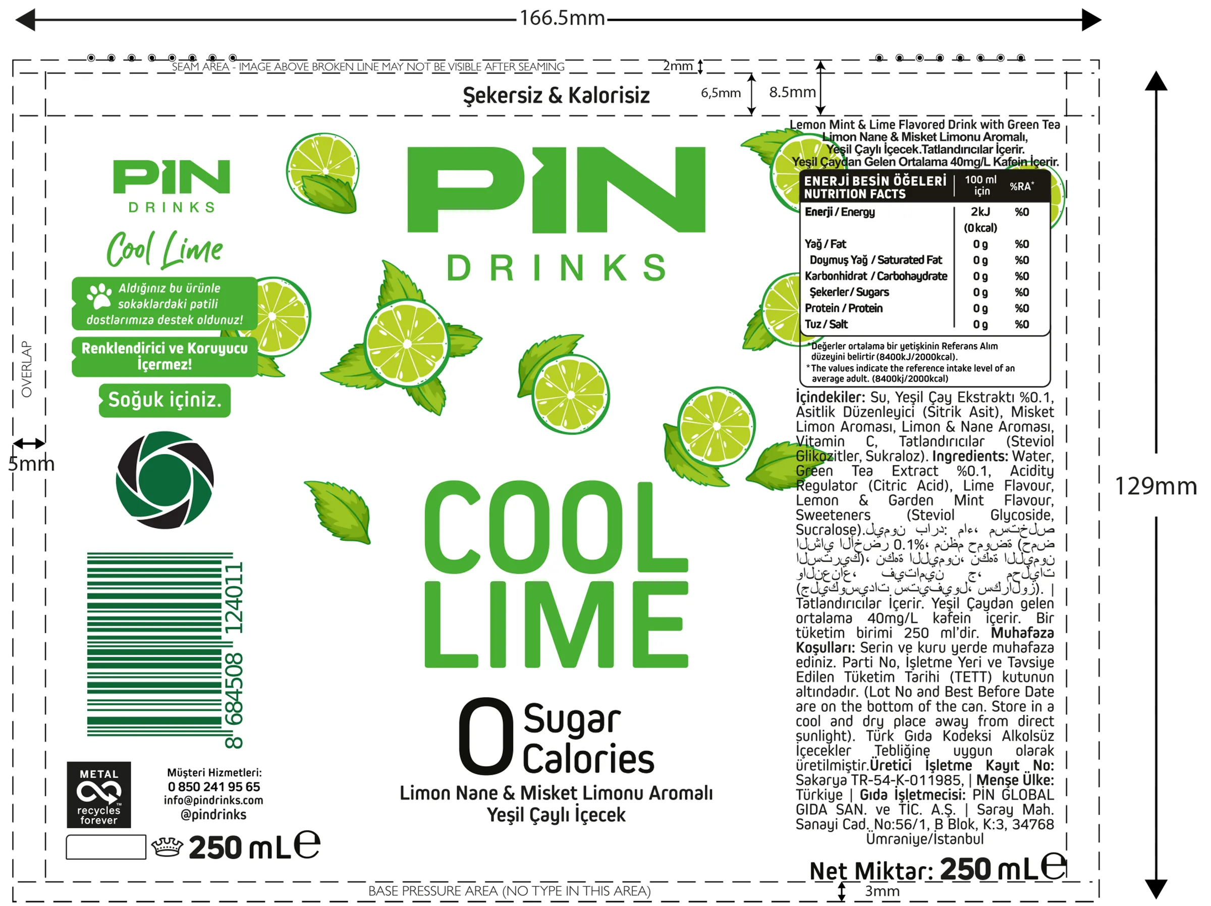
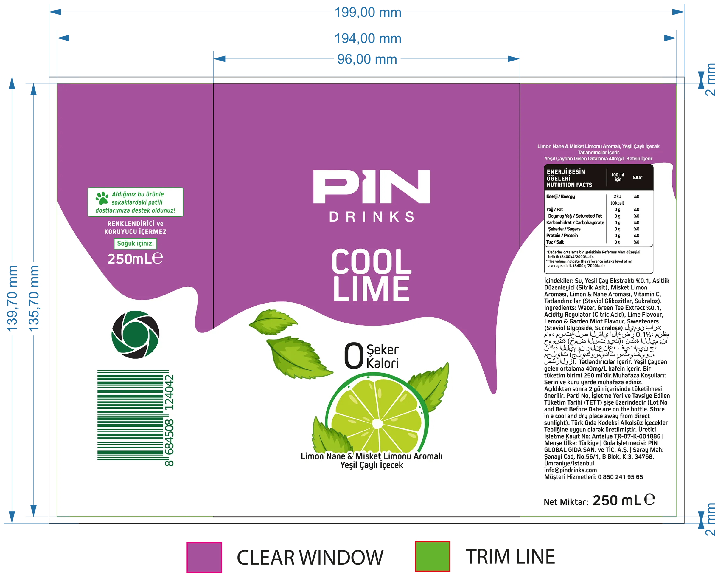
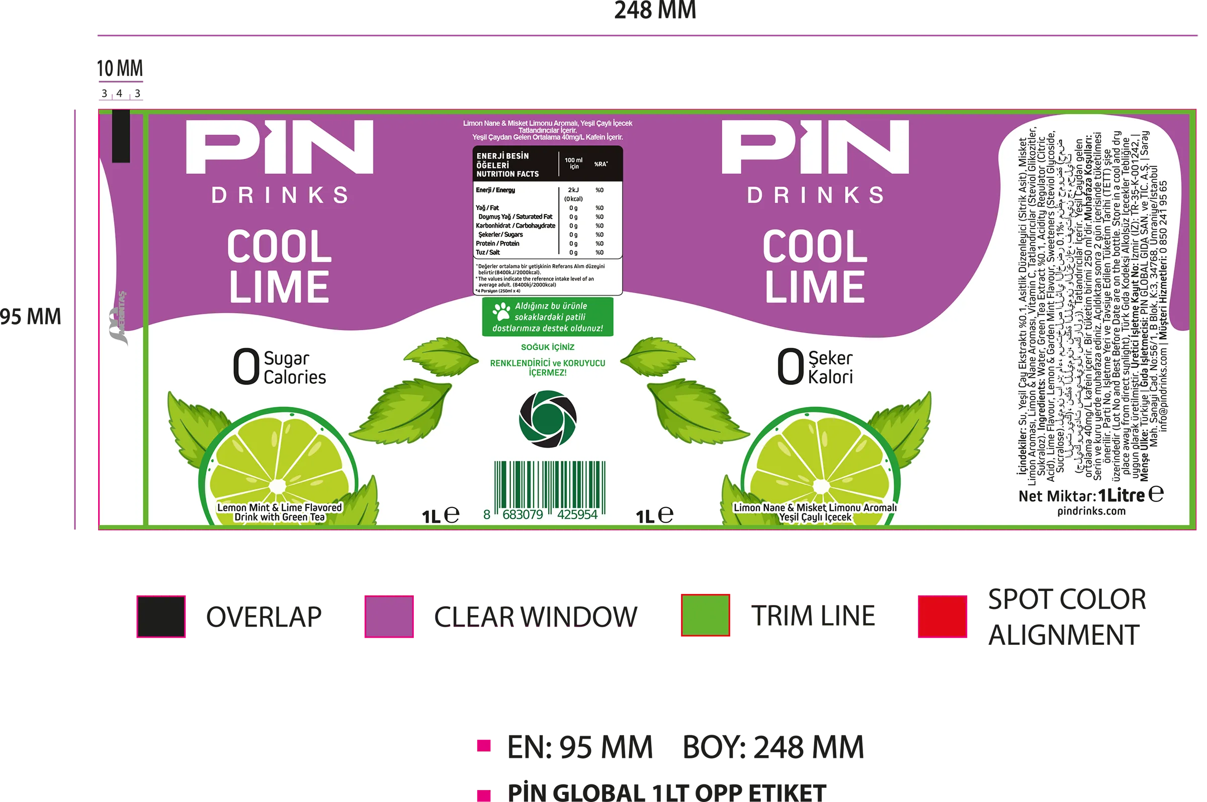
The packaging work continued well beyond visual design. For the packaging I developed, I also prepared the technical prepress artwork and coordinated the production process directly with suppliers.
Working across PET bottles, glass labels and aluminium cans meant adapting the system to different dielines, print areas, production specifications and supplier requirements.
I handled the technical preparation of my packaging work, reviewed production files and managed most of the technical communication required to move the designs from approved artwork into production.
Final print approval also sat with me. Packaging, POP and POS materials moved into production only after my approval was given to the relevant print or production supplier.
The objective was to protect the visual system through every stage of implementation, ensuring that what was designed on screen could be translated accurately into a physical product.
11 Creative Leadership
Directing the system beyond individual executions.
My role extended beyond the design of individual packaging assets. I was responsible for maintaining the overall creative direction across packaging, print materials, retail applications, event communication and selected digital content.
For work executed by designers on my team, I defined the brief, reviewed the creative direction, provided revisions and supervised the final output through production.
This also included final print approval across packaging, POP and POS materials. Production moved forward after my approval was given to the relevant supplier.
The objective was to keep every application aligned with the same visual standards, regardless of who executed the individual asset.
- 01Briefing
- 02Creative Direction
- 03Revisions
- 04Prepress
- 05Final Approval
- 06Production Supervision
12 Beyond Packaging
Extending the identity across commercial touchpoints.
Once the packaging system was established, the same visual principles were extended across the brand's wider commercial ecosystem.
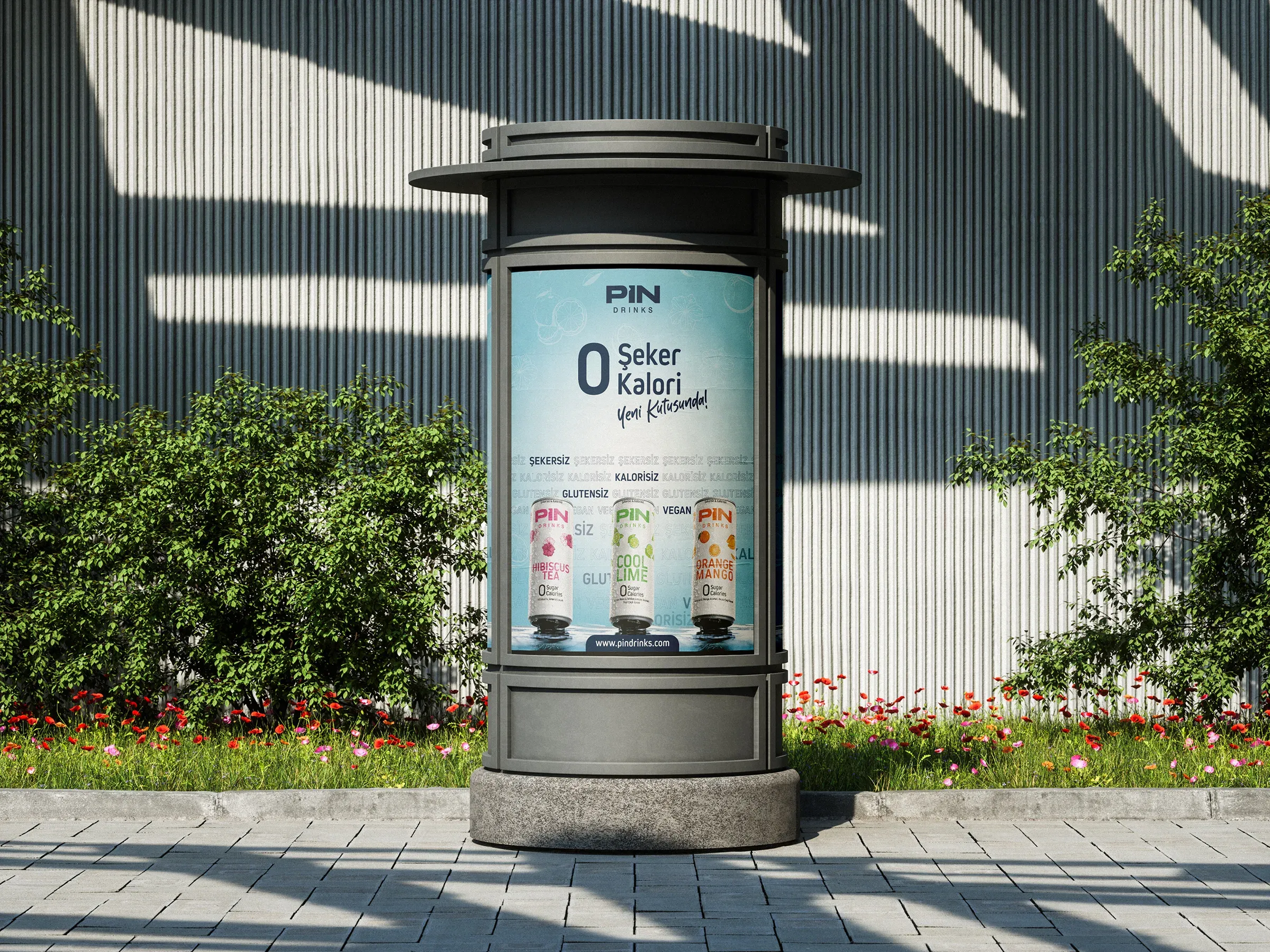
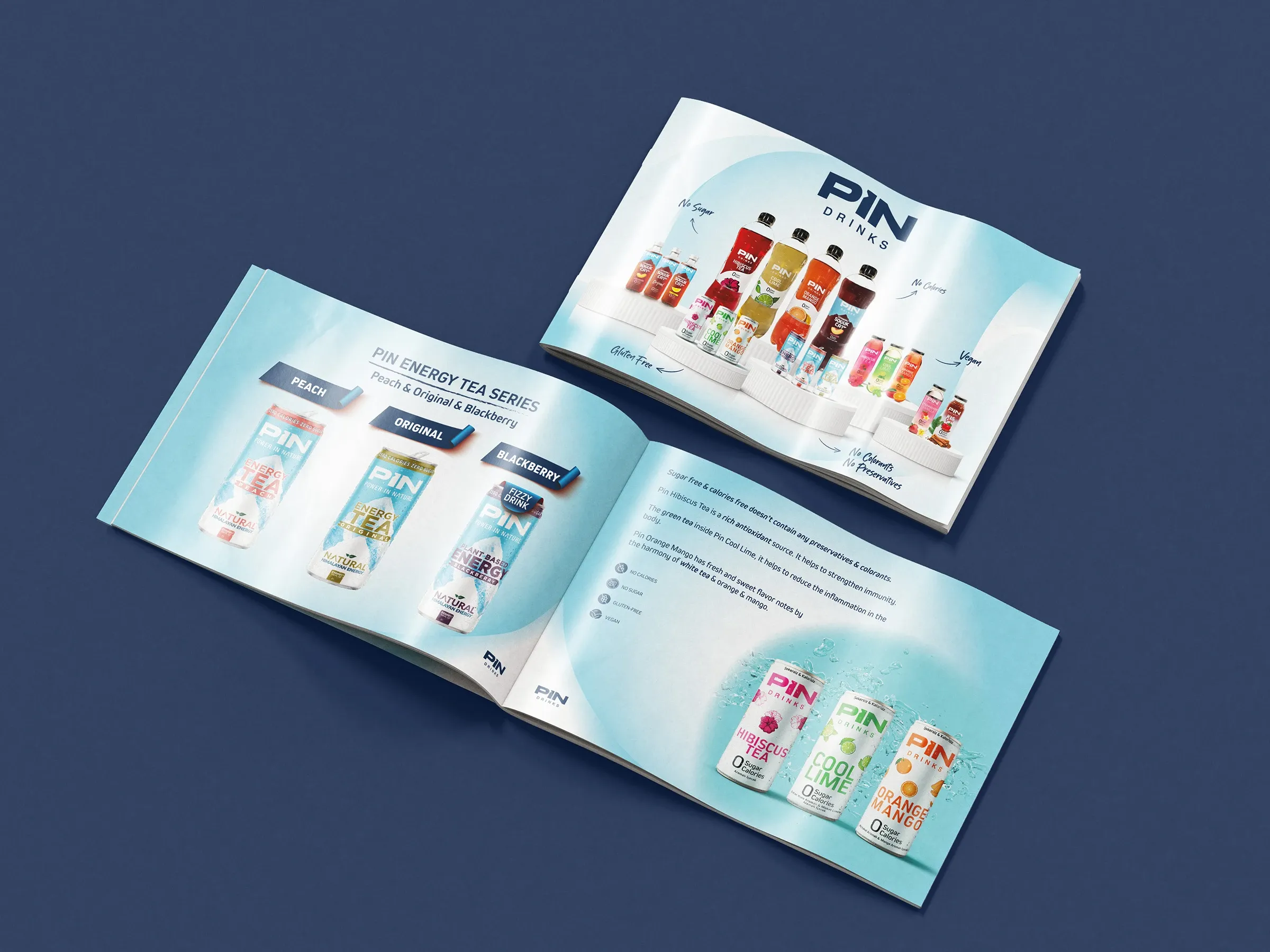
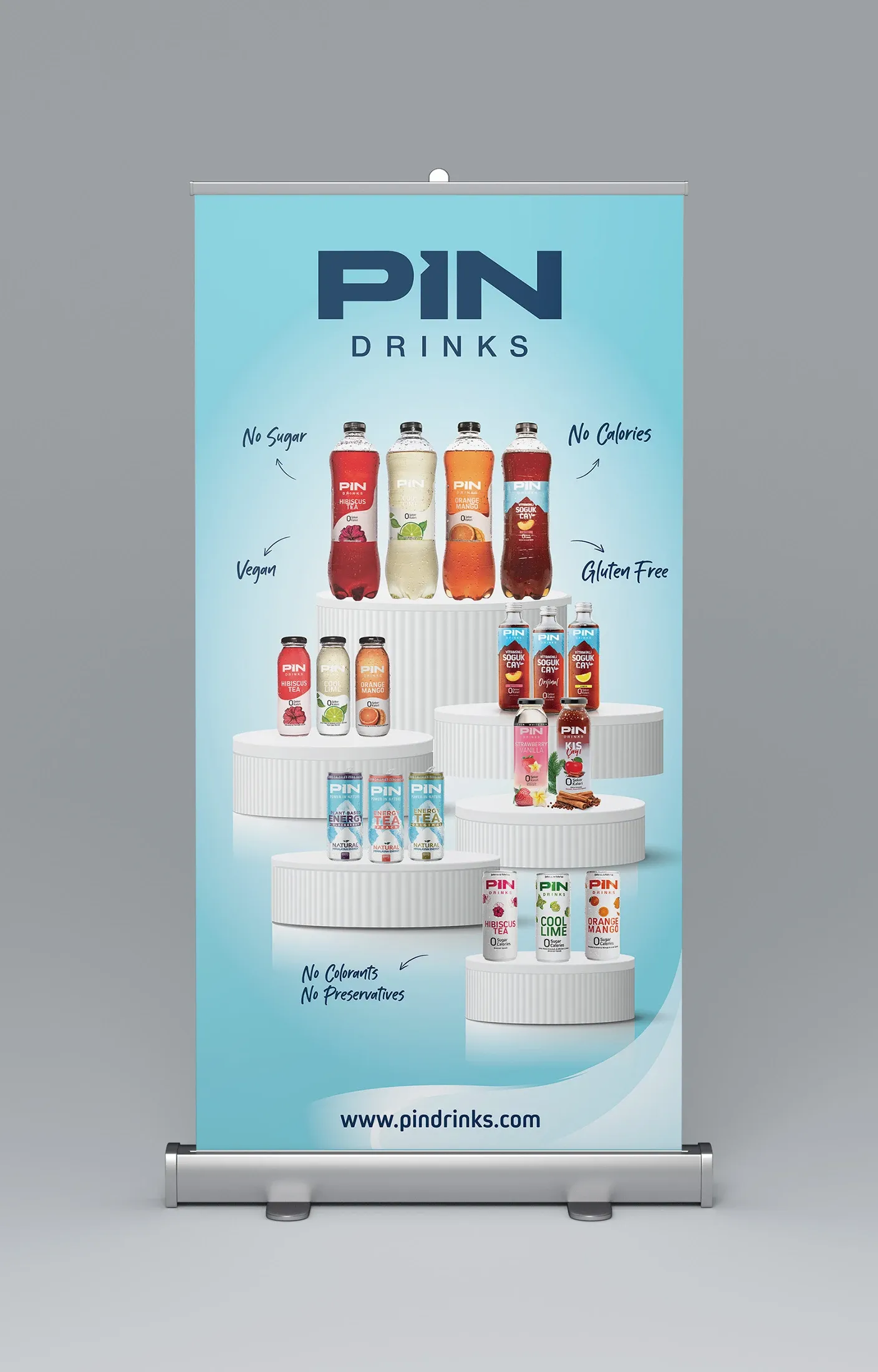
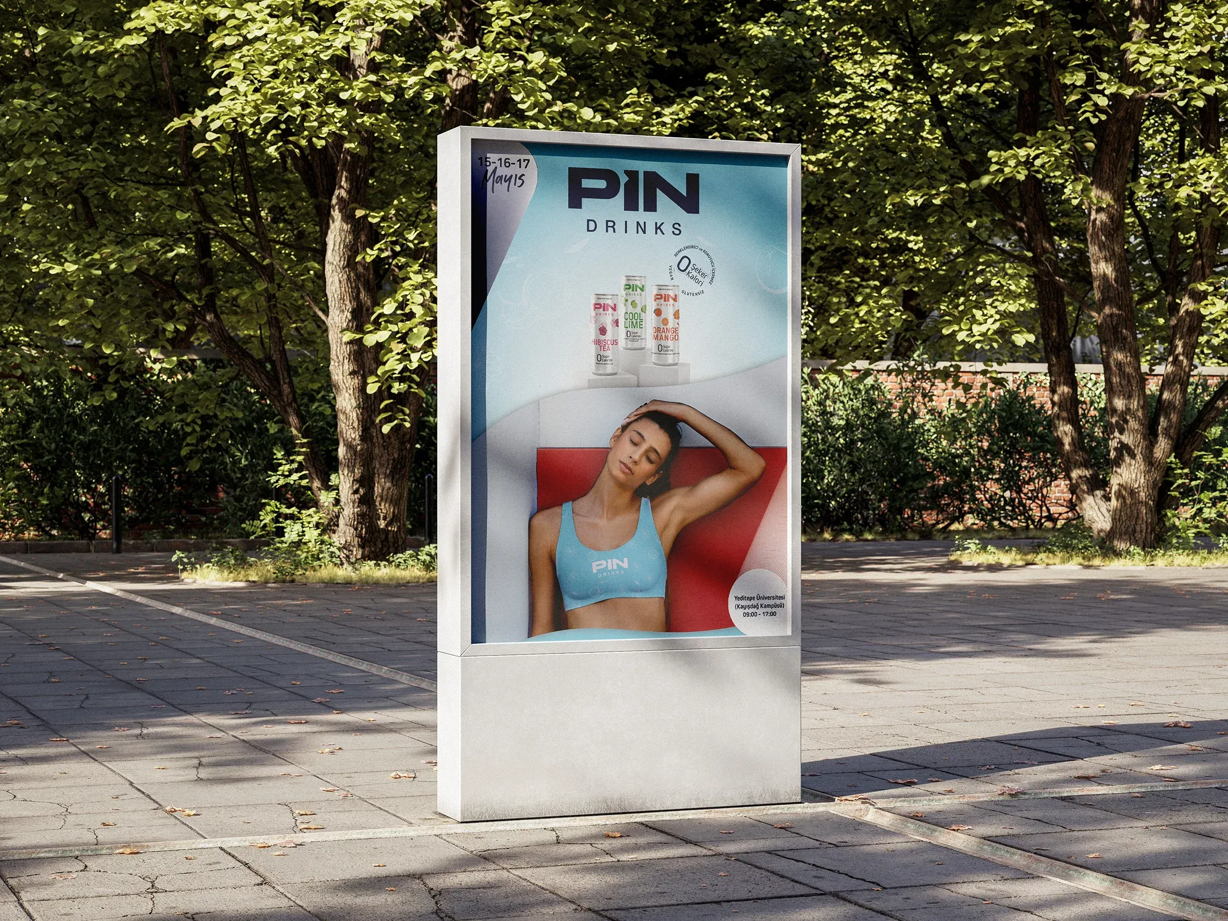
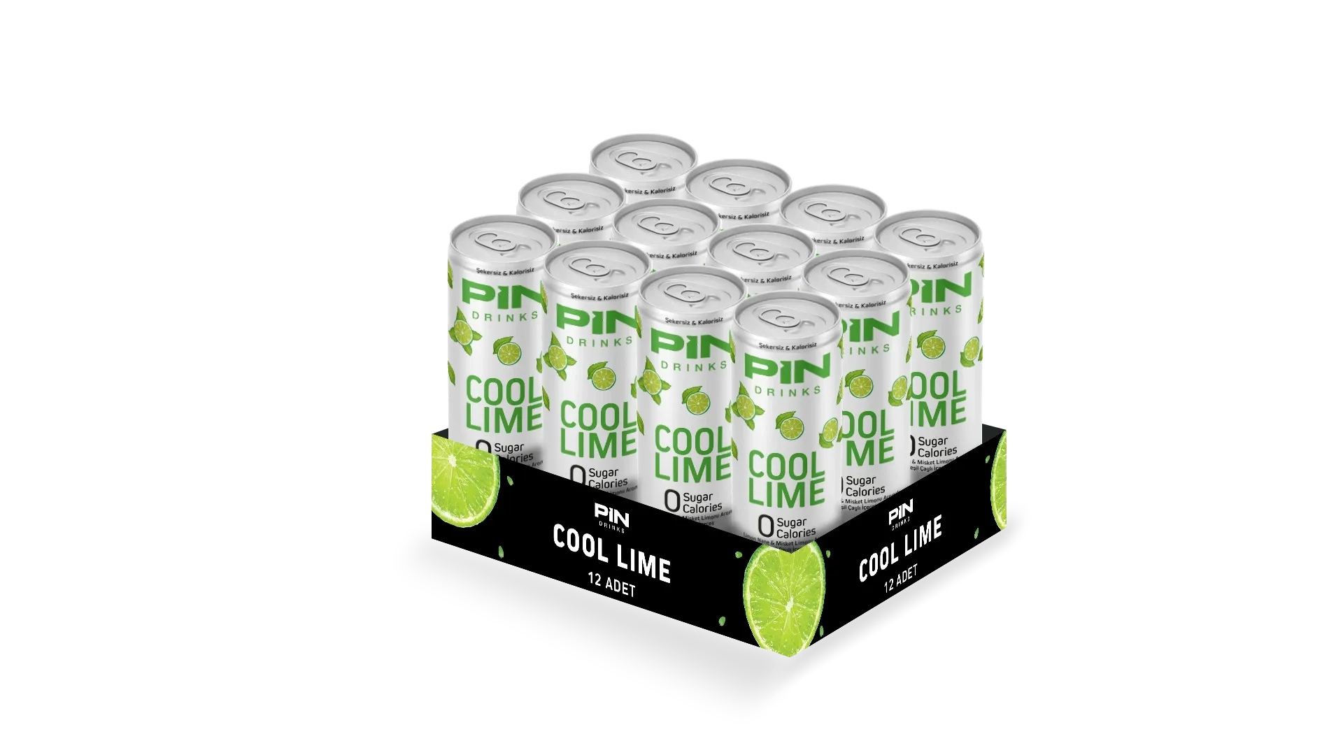
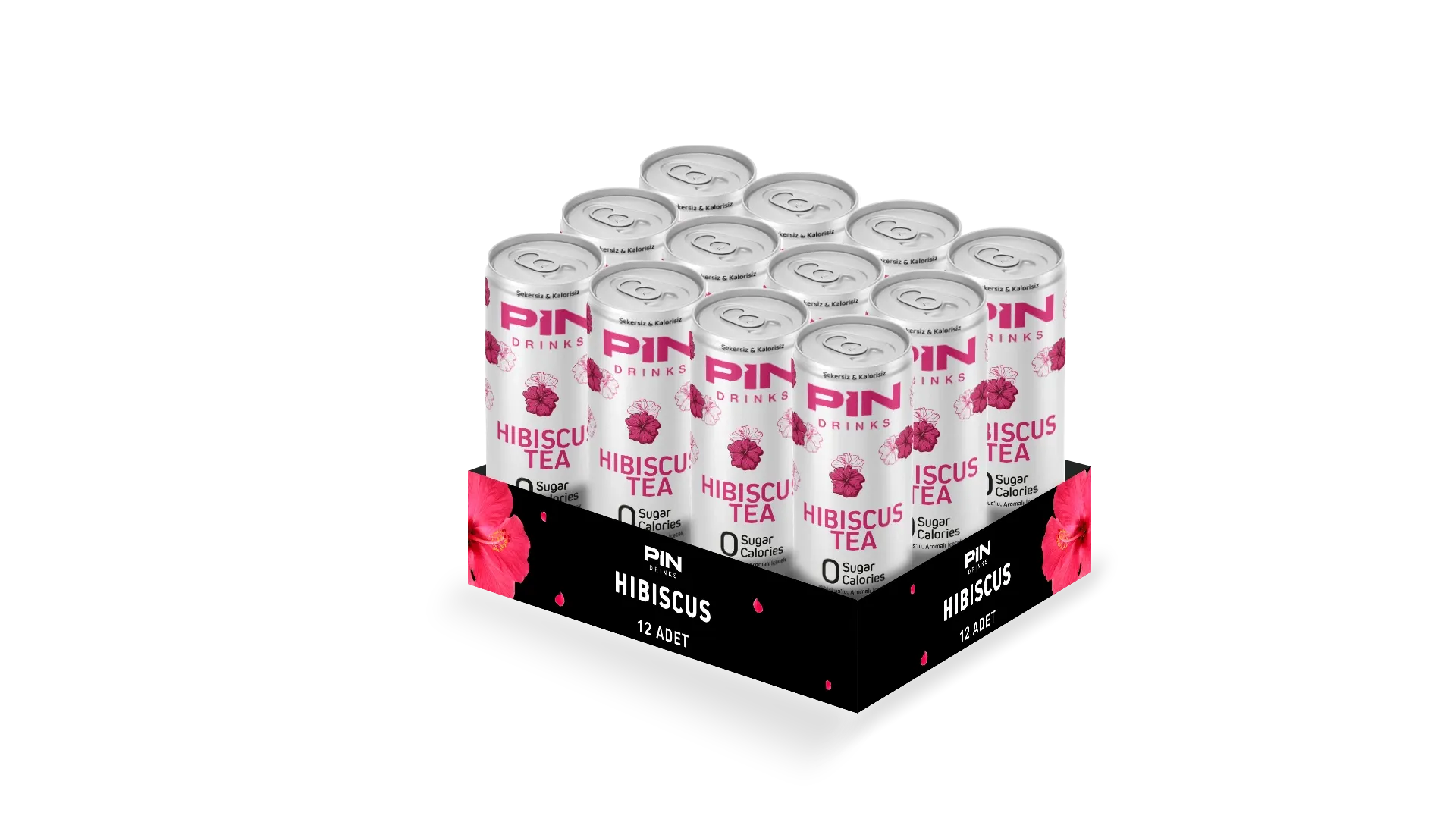
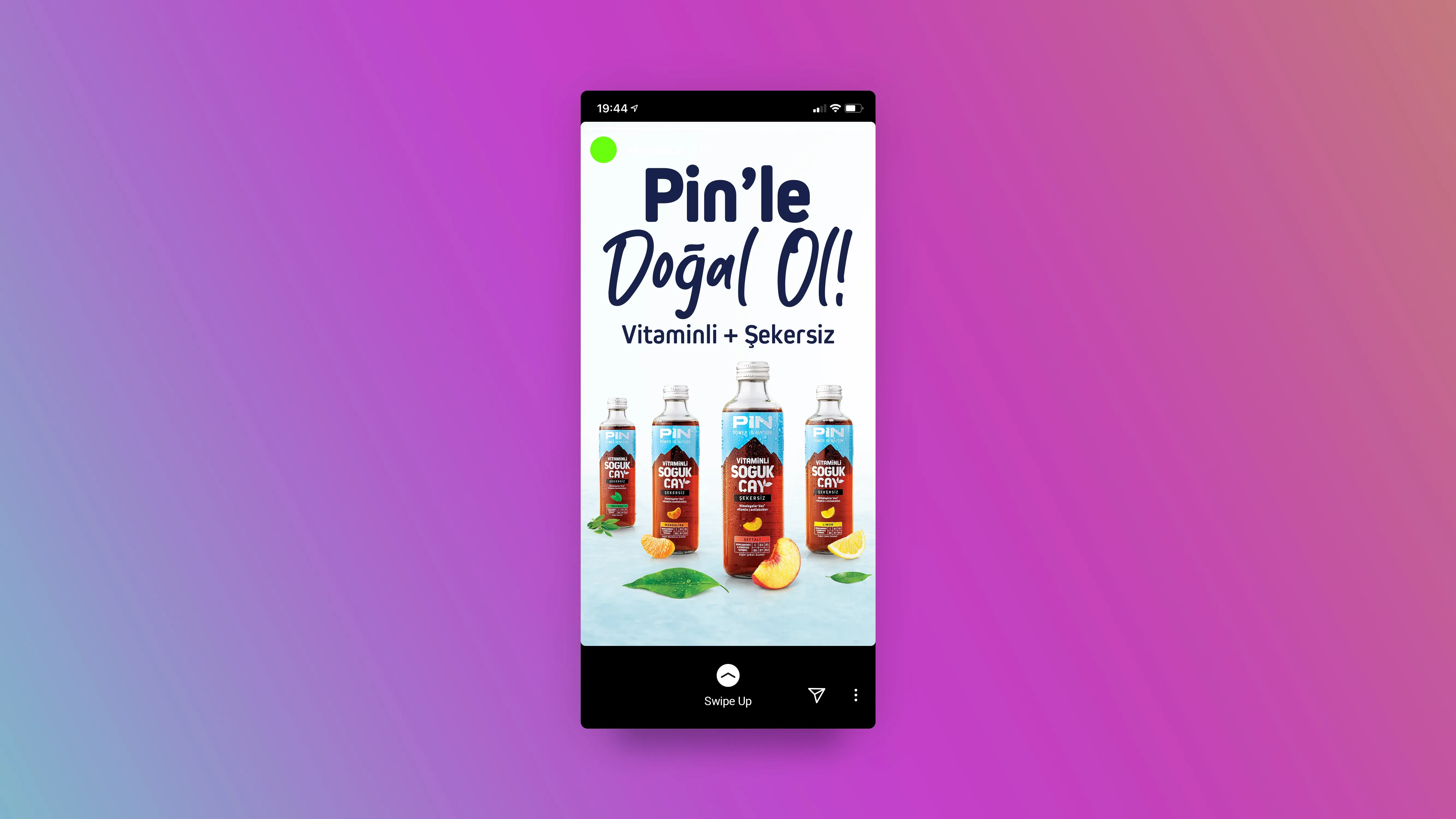
I designed selected applications and creatively directed others, including outdoor advertising, the English product catalogue, roll-up displays, e-commerce visuals, event materials and social content.
Rather than treating each output as a separate campaign asset, I used the packaging system as the visual foundation. White space, flavour coding, product hierarchy and illustration language were carried across formats so that the brand remained recognisable beyond the shelf.
This allowed Pin to present a more consistent identity across retail, sales, event and digital environments.
Commercial Communication
Retail & Event
Digital Commerce & Social
13 Motion / Launch
Bringing the packaging system into motion.
The launch motion translated the new can design language into a dynamic digital format.
The visual system was carried into motion through the same core elements used on packaging: strong flavour coding, clear product hierarchy and a clean graphic structure.
Rather than introducing a separate campaign language, the motion built directly on the packaging identity, helping the new aluminium can range feel consistent across static and moving applications.
14 Campaign Production
Extending the brand into campaign production.
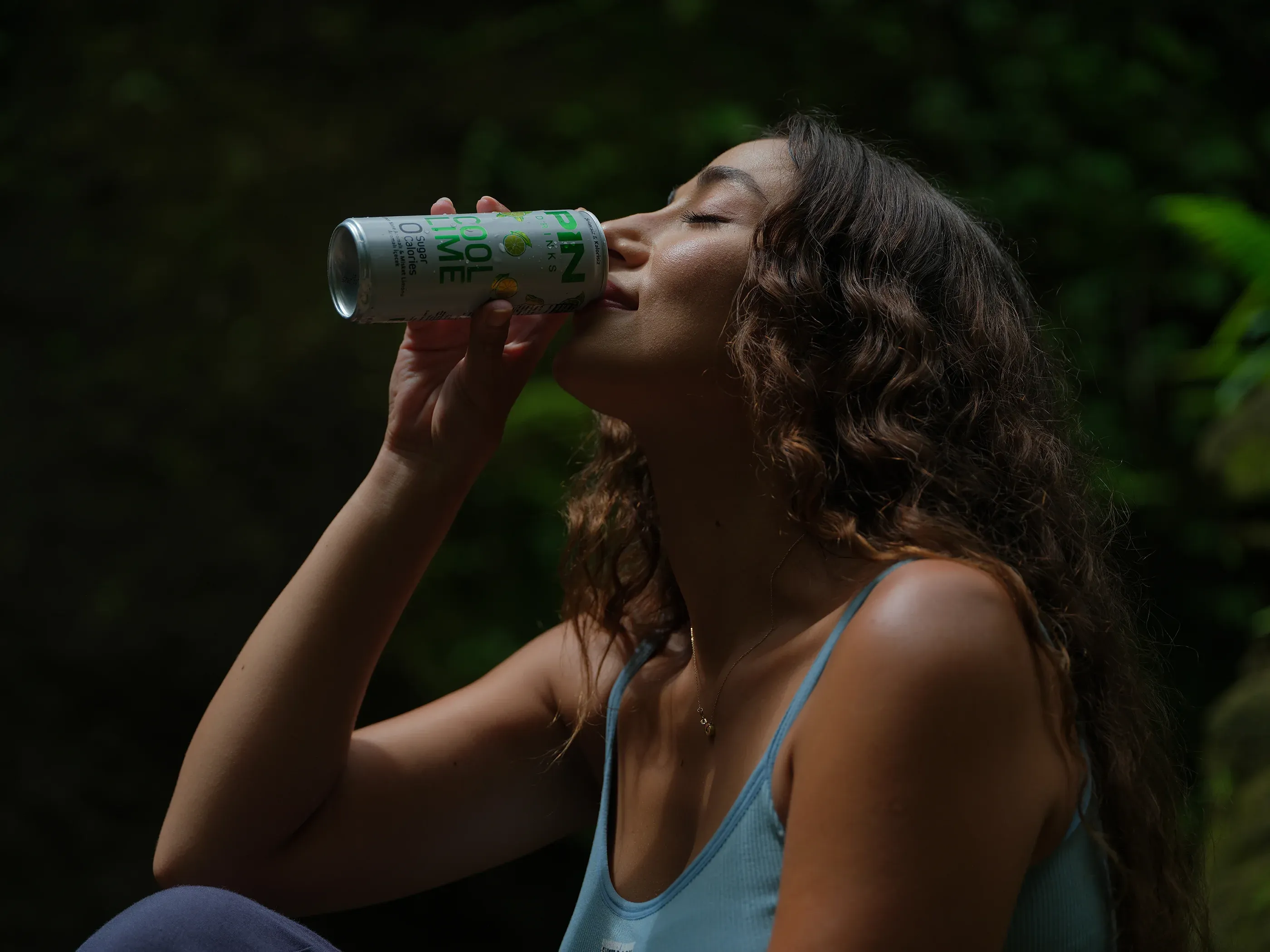
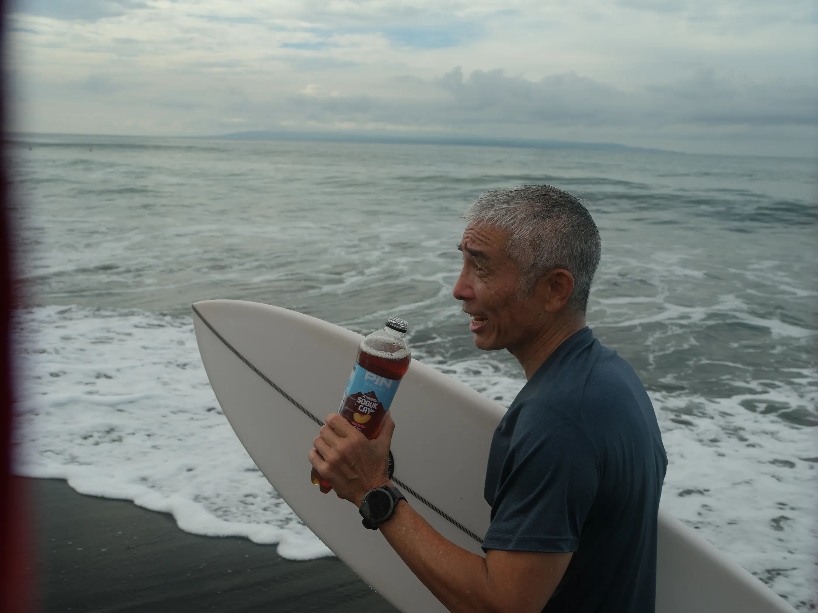
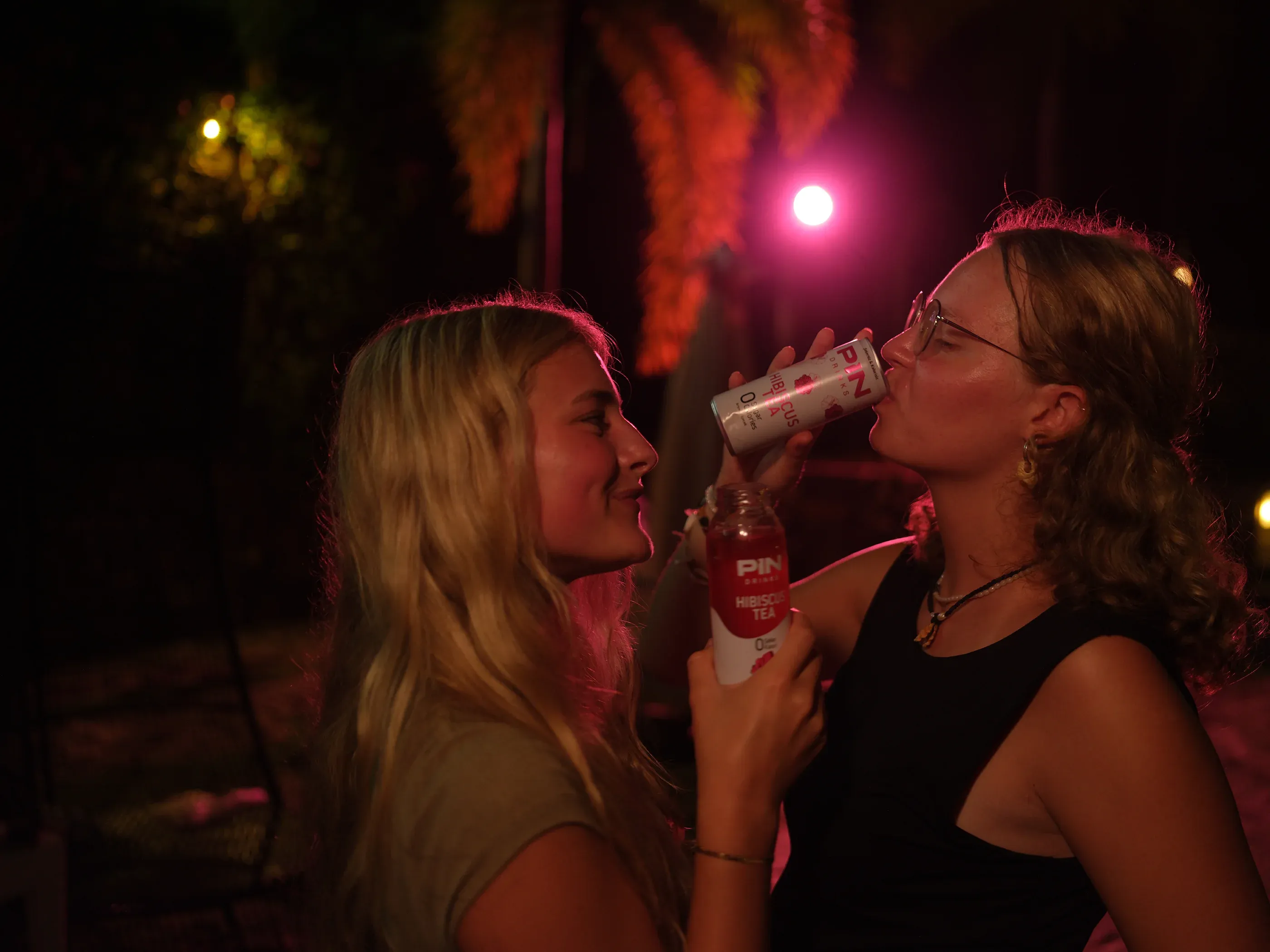
The packaging transformation also informed the wider campaign world of Pin Drinks.
For the main campaign films, concept development, storyboard development and art direction were shaped collaboratively with the internal team and Kouem Entertainment. The productions were directed by Emre Başaran, with lifestyle photography and creative production contributions from Mehmet Turgut.
My role focused on helping shape the visual direction, ensuring that the campaign world remained connected to the brand and packaging system.
I was not responsible for technical shooting, directing or editing. My contribution was centred on concept development, visual direction and brand consistency throughout the production process.
16 Designed for the Shelf. Proven on the Shelf.
Designed for the shelf. Proven on the shelf.
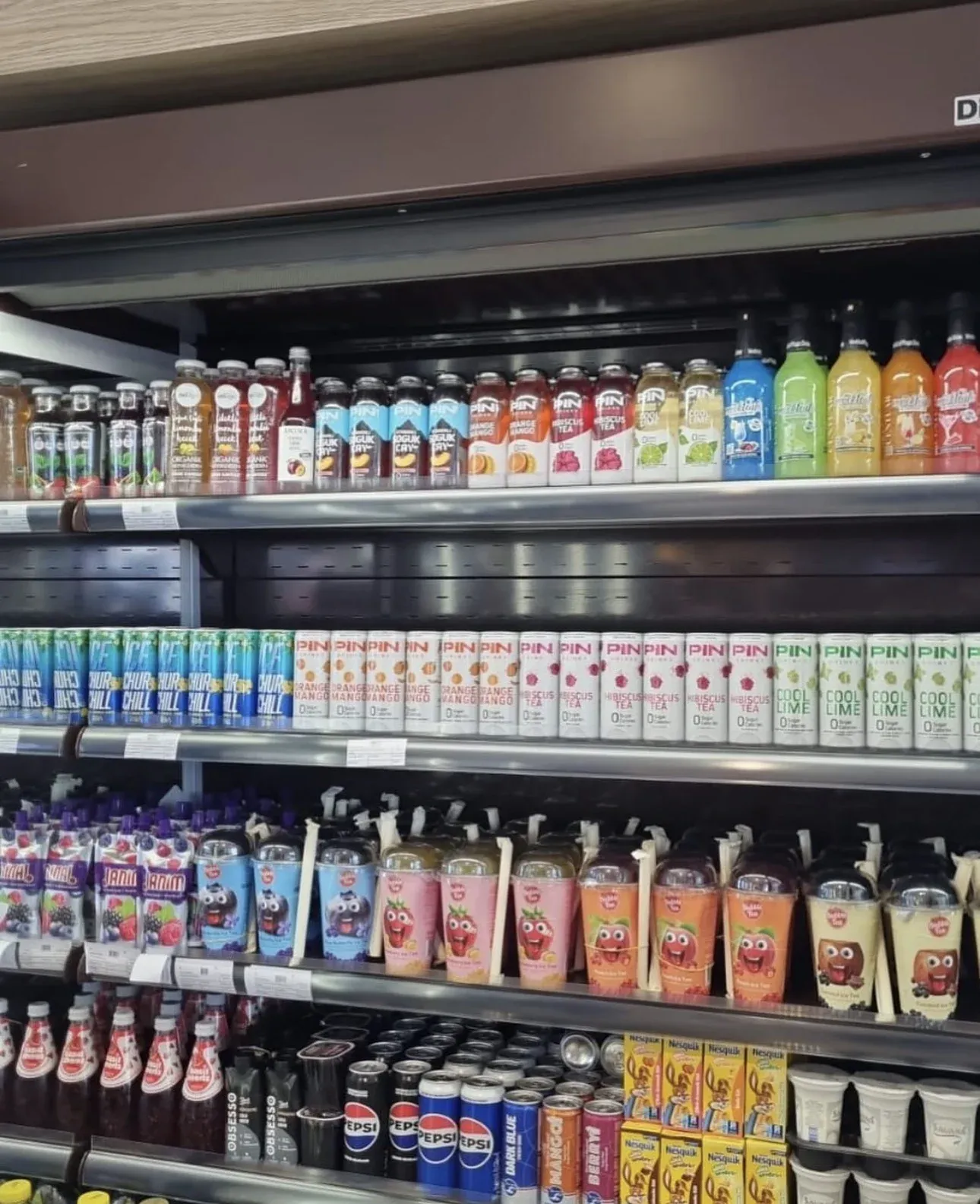
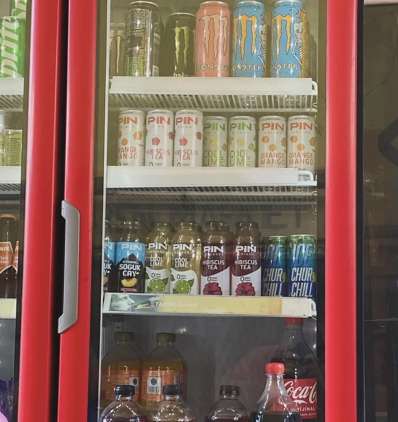
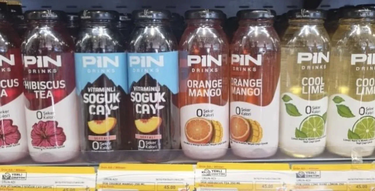
The system was developed with real retail conditions in mind, not only presentation renders.
Once in production, the new packaging created a more consistent family presence across different flavours and formats. The predominantly white structure gave the range a recognisable shared foundation, while flavour colours and illustrations helped individual products remain easy to distinguish.
Seeing the system together in real retail environments became an important test of whether the identity could maintain its clarity beyond controlled design presentations.
17 Outcome
A system built to continue beyond the project.
By the end of my engagement, Pin had moved from a limited and fragmented packaging structure to a more coherent visual system that could operate across flavours, formats and commercial applications.
The new direction received consistently positive feedback from internal stakeholders, distributors and consumers.
More importantly, the system continued to be used after my engagement ended. Later product adaptations were developed from the same visual foundation, showing that the identity could continue functioning beyond the original rollout.
18 Recognition
Recognition
2024 Nominee
The Canmaker Cans of the Year Awards
Beverage Two-Piece
Decoration & Print Quality
19 Credits
Credits
- Creative Direction
- Efe Can Akar
- Brand Design & Packaging
- Efe Can Akar
- Custom Fruit Illustrations
- Efe Can Akar
- Packaging Prepress & Production Coordination
- Efe Can Akar
- Final Print Approval
- Efe Can Akar
- White Peach Packaging
- Creative Direction: Efe Can AkarDesign Execution: Esra Atmaca
- Event Materials
- Creative Direction, Briefing, Revisions, Prepress & Production Supervision: Efe Can AkarDesign Execution: Pin Design Team
- Social Content
- Art Direction: Efe Can AkarProduction: Efe Can Akar, Zeynep Ağmaz & Esra Atmaca
- Campaign Films
- Concept & Art Direction: CollaborativeProduction: Kouem EntertainmentDirector: Emre Başaran
- Lifestyle Photography / Creative Production
- Mehmet Turgut
- Lifestyle Image Selection
- Efe Can Akar + Pin Team
- Product Photography
- External Photographer
- Product Image Editing
- Efe Can Akar & Esra Atmaca
- Packaging Production Partners
- Merintaş Label & PackagingBivaş Label & PackagingCrown Holding Co.
15 Social Art Direction
A more direct creative role in social content.
For TikTok and Reels content, my involvement was more hands-on.
I led the art direction and worked directly with the team on production, shaping how the brand appeared in short-form social content.
The objective was to retain the same recognisable visual language while adapting it to a faster, more spontaneous and platform-native format.
This created a social expression of the brand that felt connected to the wider identity without simply repeating the packaging or campaign films.